FIRST YEAR STUDIO
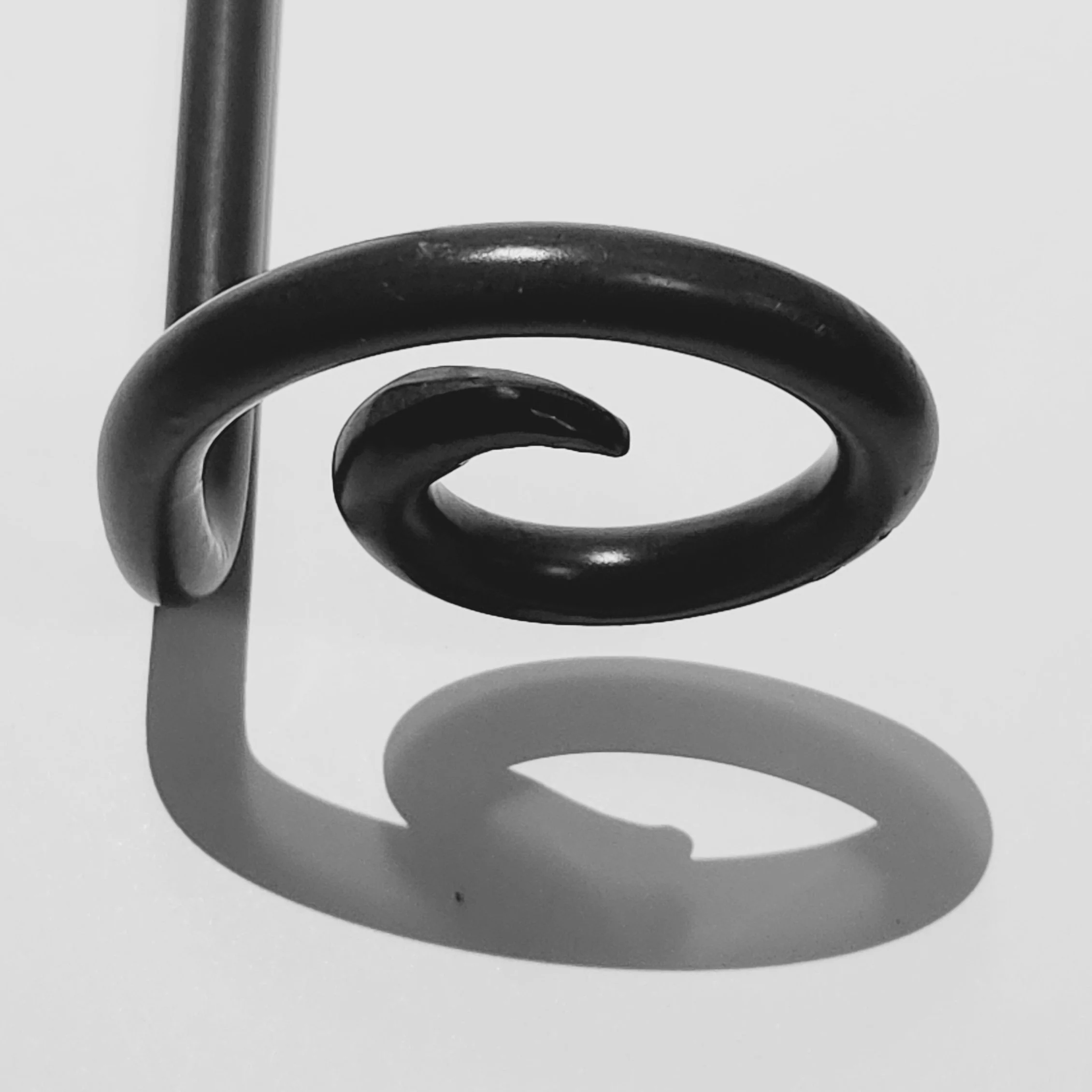
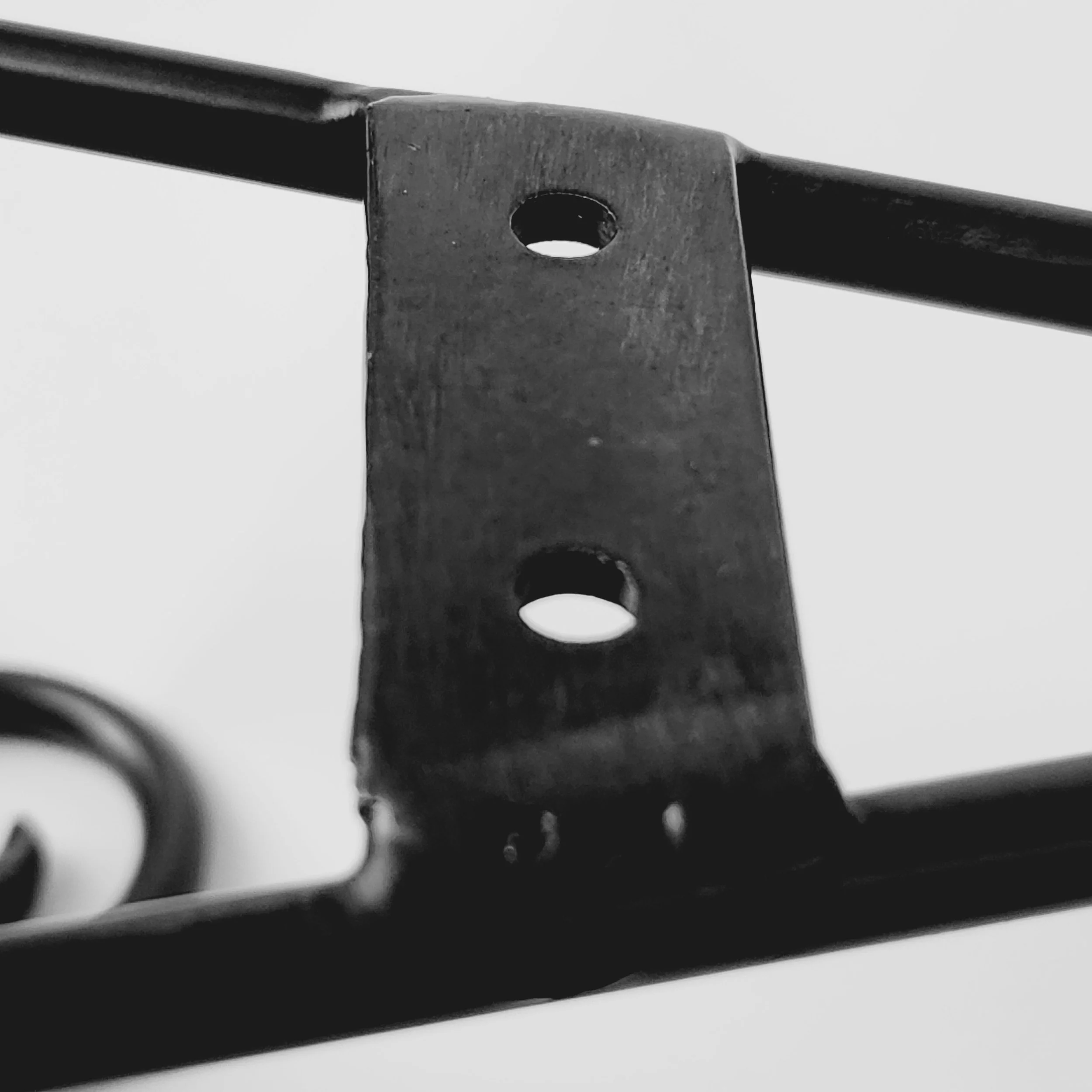
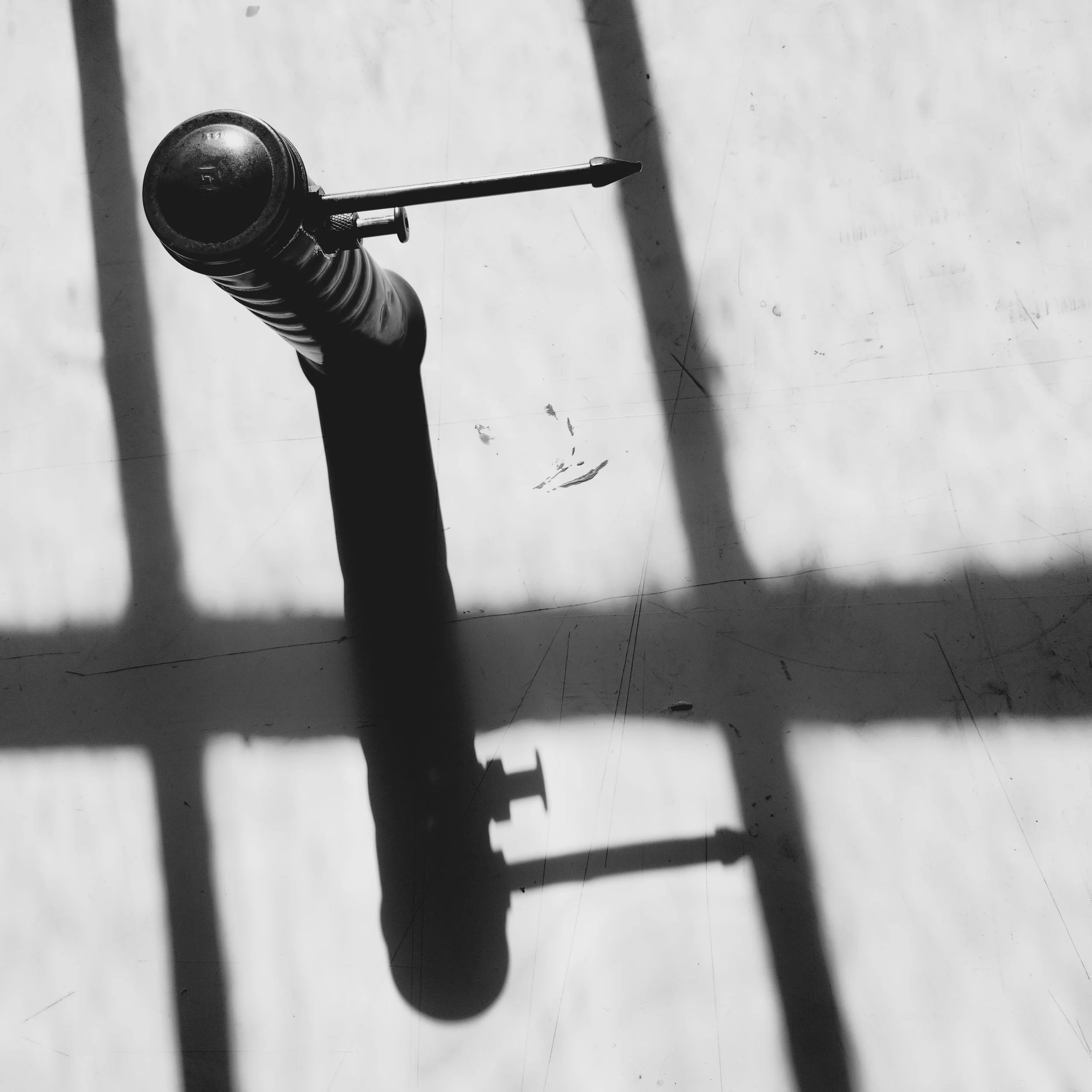
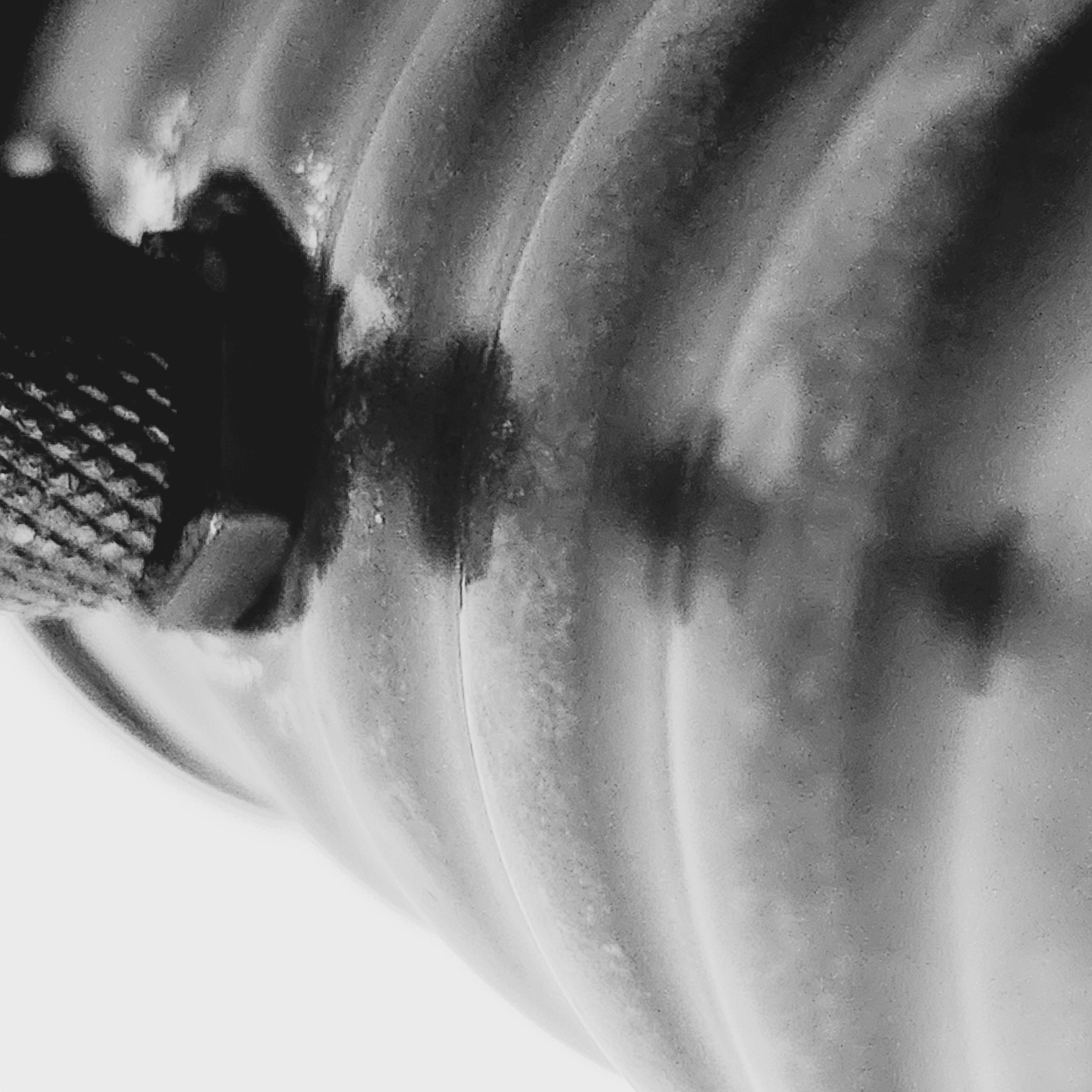
Module 0 involves exploring the elements and principles of design through photography and mundane items around us.
Design elements include; line, shape, direction, size, texture, color/hue, tone/value, and gradient.
Design principles include; balance, contrast, economy, emphasis, proportion/scale, rhythm, and unity.
After experimenting with the first object from above, I changed objects for the final set of seven pictures.
These pictures were chosen as the best representations of balance, contrast, economy, emphasis, proportion/scale, rhythm, and unity (respectively).
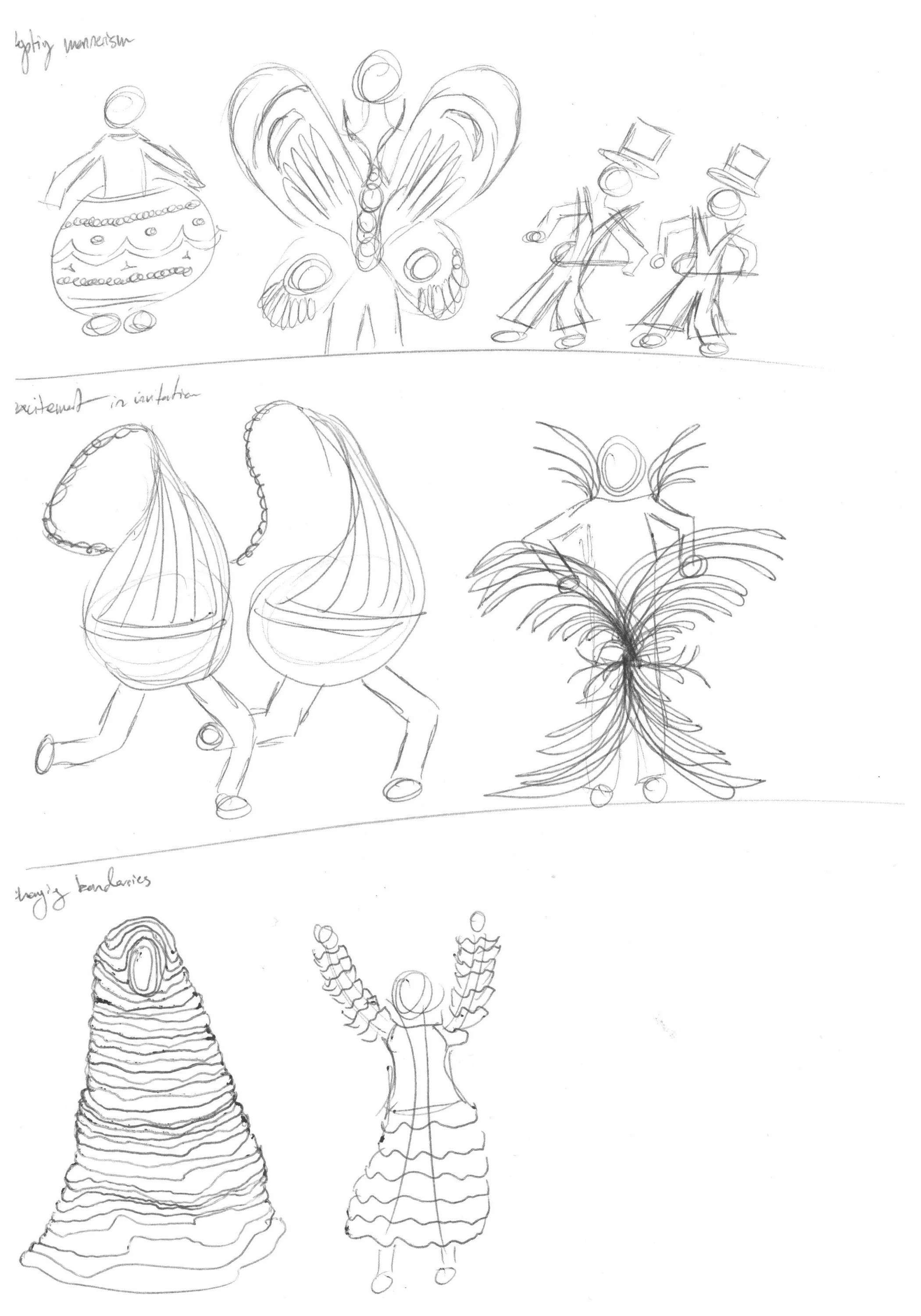
Module 1 explored relationships with our own bodies and the people around us. Through abstraction alongside studies of form and material we created paper wearables in partnerships. The goal was to embody exhibit something by both people in the partnership.
The first 4.5 weeks of the 6 week project were spent in ideation. This is the brainstorming phase. We repeatedly cycled through diverging and converging rhythms. Coming up with even more ideas before narrowing down on a select few. Seeing what made certain ideas work better than others helped us in creating even more ideas later on.
Ideation involved the relationship concepts themselves, as well as ways to manifest them in a paper wearable and research into precedents.
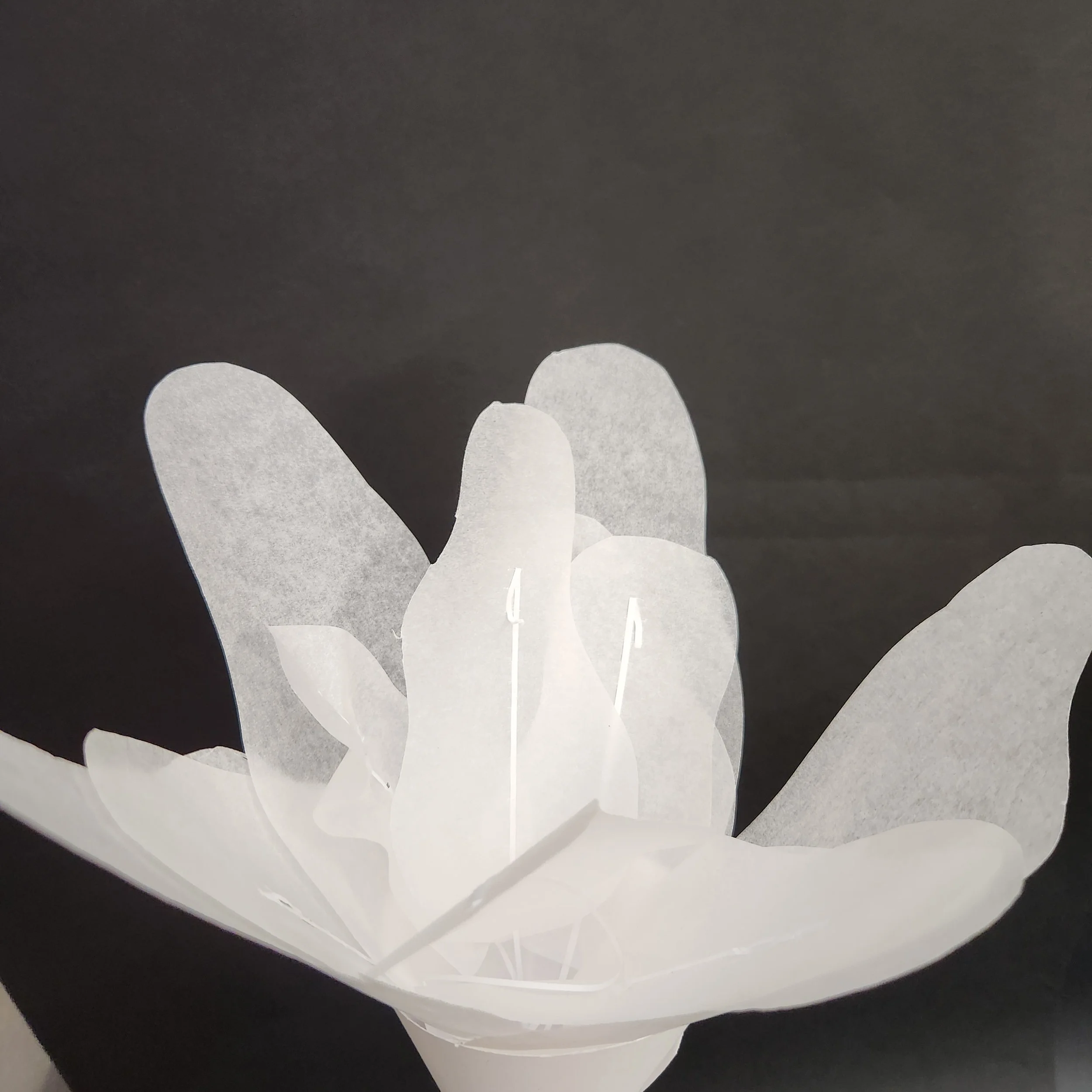
We explored a variety of manipulation methods to use on paper. These included folding, scoring, bending, curling, crumpling, wetting, molding, pulping, casting, cutting, layering, laminating, interlocking, notching, weaving, stitching, and burning.
Using the information gathered in previous weeks, we came up with a final proposal and accompanying prototype.
There were quite a few hiccups at this stage. Our initial prototype collapsed under the weight of a paper mache shell. The second prototype was significantly scaled back in ambition.
After constructing and presenting our prototype, we received feedback and critiques from our fellow classmates and instructor.
Considering the responses and our own feelings around the success of the prototype, we came up with a different direction. The final week of the project was devoted to the construction of the final version of the paper wearable.
FINAL CONSTRUCTION
--
FINAL CONSTRUCTION --
Although the final construction was highly successful, there are always improvements that can be made. After reflection, here are some possible improvements:
Module Shop took us through developing basic woodworking skills, gaining competence at using the different tools in the wood and metal shop.
This module was framed as a competition. Each of the 7 studio sections would end with 2 groups, making for 14 groups of 10 people. Each group would come up with a children’s toy design, making a set with 48 different pieces as well as packaging and a logo.
The Color Module included investigations into the science and psychology of color in the form of a four workshop series, as well as a choose your own adventure project using color and light as central elements
I chose to make a series of photo portraits. These portraits would attempt to tell the story a person’s personality through the use of color grading, going beyond traditional portrait photography which tells stories through form and subject.
I made three series of portraits, where each series contained four photos of the same person.
The subjects were all my friends, and reflected a list of fifteen primary personality traits as well as a personalized color palette made from their list of personality traits.
DARCY
Both the list of personality traits and the color palettes were made in collaboration with the subjects themselves.
Initial versions were made by my own judgement and research in color association psychology. There is a fascinating world of research on weight, feeling, and perception of colors.
Each subject had their own interpretations and feedback to give, which led to the final color palettes chosen.
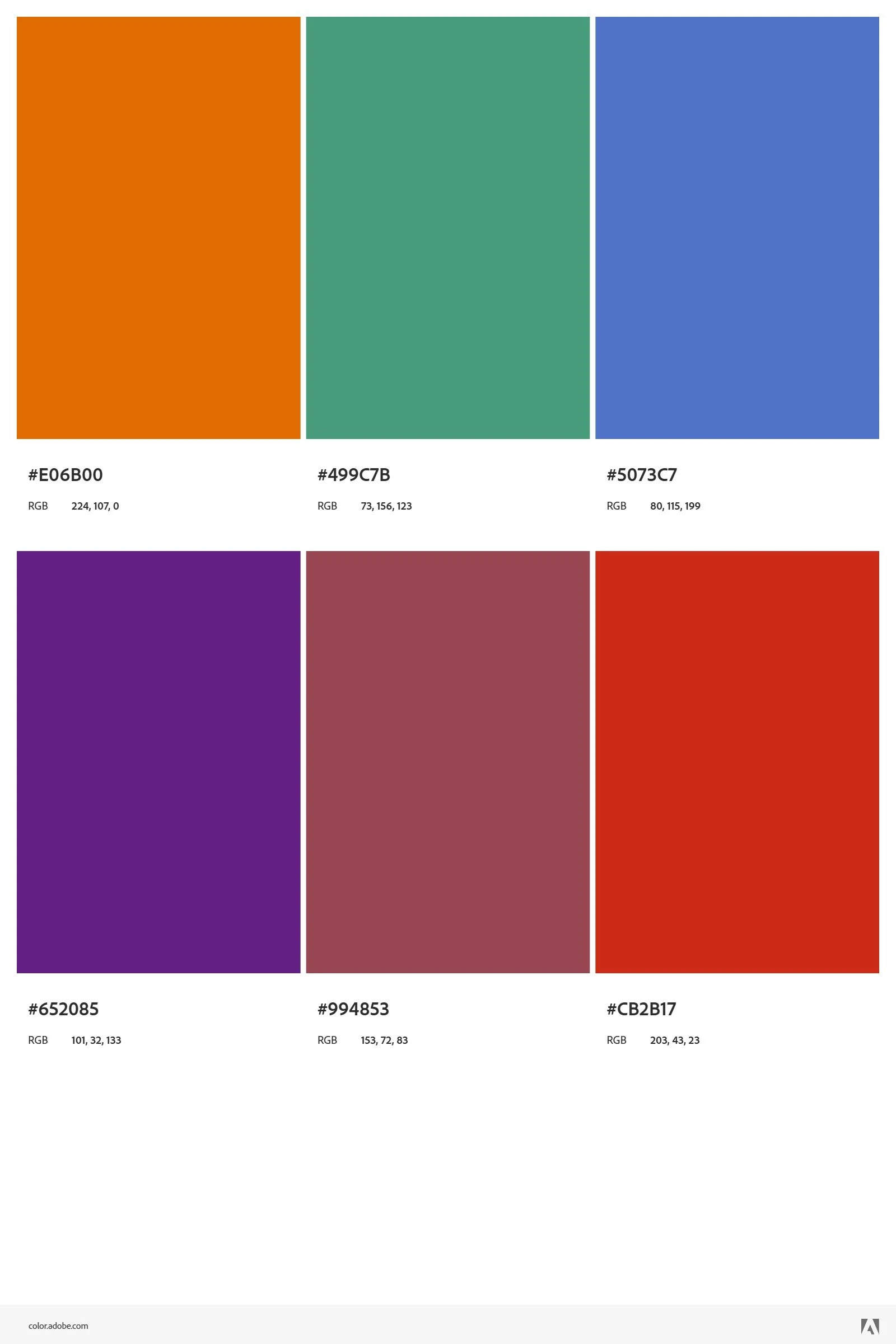
Darcy’s Color Palette
ALLY
Ally’s Color Palette
PARKER
Parker’s Color Palette
Even after coming up with color palettes, I still had to decide how use them to color grade in a way that felt representational of the entire palette and the person.
I went through many tests before finding a style I was happy with for each person, and that displayed well.
This project explored my passion for photography and expanded my knowledge of color and how to manipulate it.


