2023 Portfolio
2023 Portfolio
ELISHA DAUGIRD
I am a designer inspired by nature, Solarpunk ideas, sustainability, and a deep hope for a beautiful future. I find joy creating solutions and ideas that reflect my values, working towards bettering our collective future.
I am a first-year student at North Carolina State University, currently majoring in Design Studies. I’ve always been intrigued in by the pursuit and use of creativity for the benefit of others. Both my mother and my grandmother are experienced artists in their own right, and I’ve always felt inspired by them. Whether it was seeing one of my grandmother’s product packaging designs in a grocery store, or watching my mom paint a new canvas in her studio, the strength and beauty in sharing a piece of oneself in a physical manifestation has always been wonderful to see modeled out.
I didn’t always know that I wanted to follow in their footsteps, but since learning that about myself I’ve wanted nothing more. Pursuing industrial design at university is the current step in my journey as a designer, but I’m always looking for new opportunities and experiences.
01 - STAIRS
2019
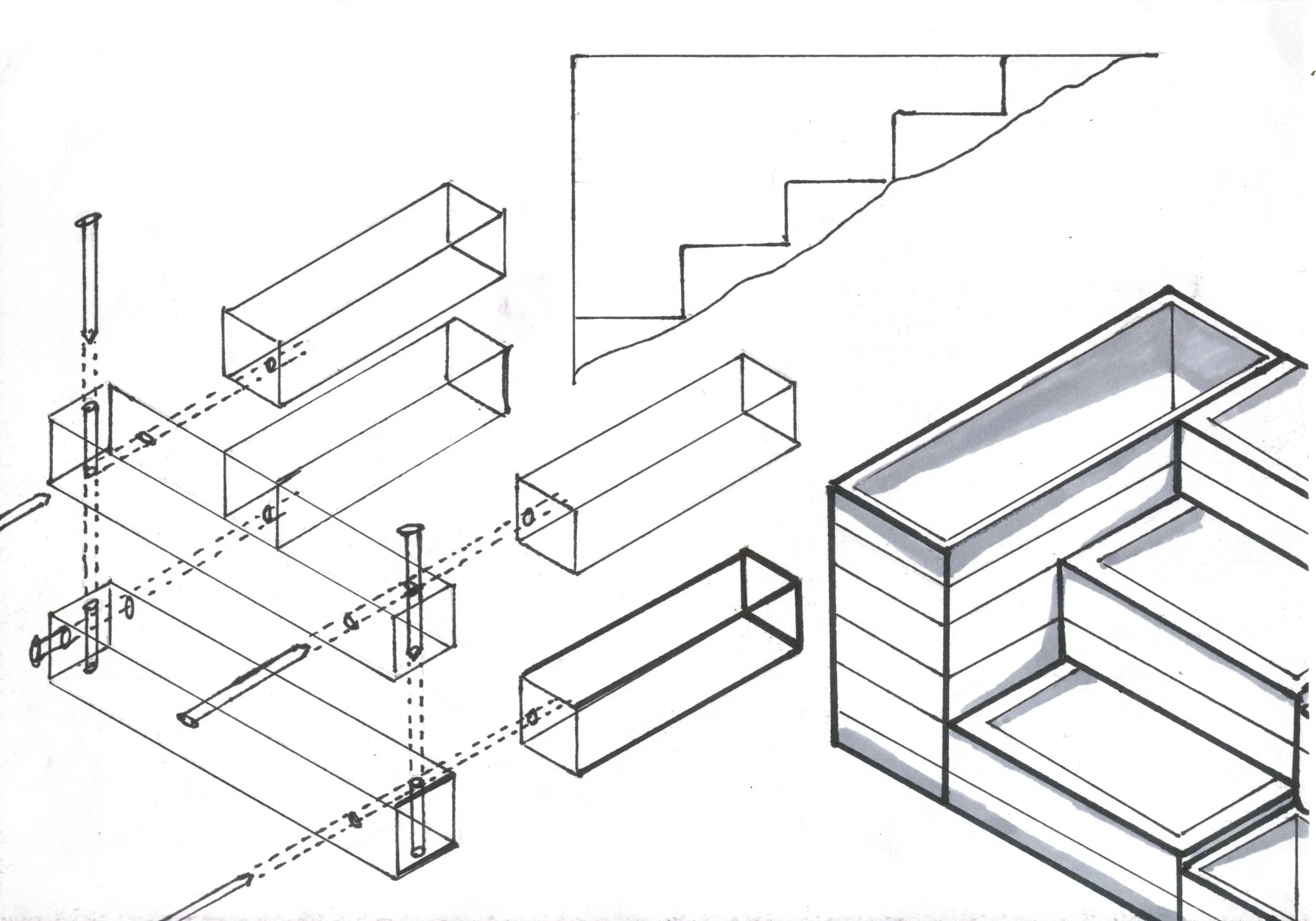
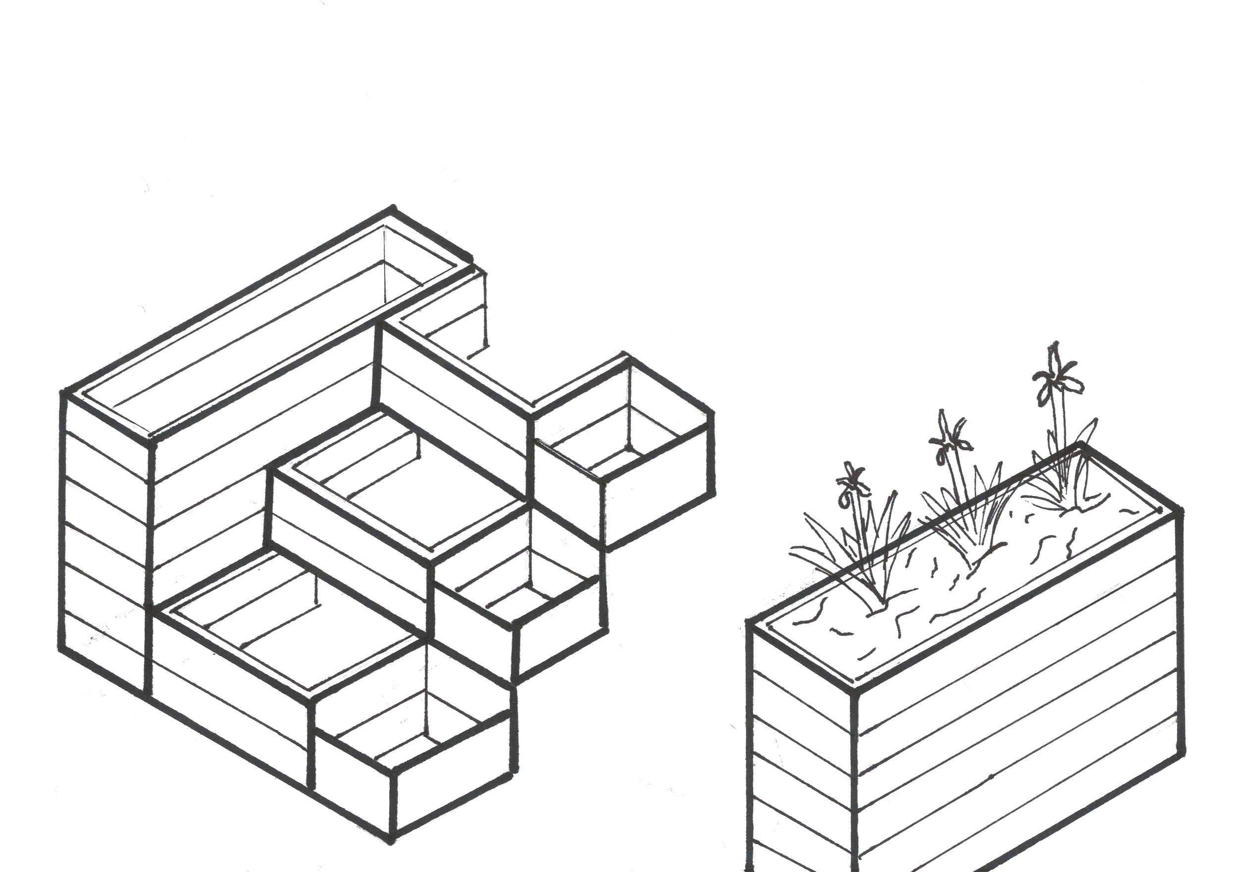
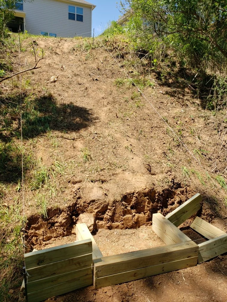
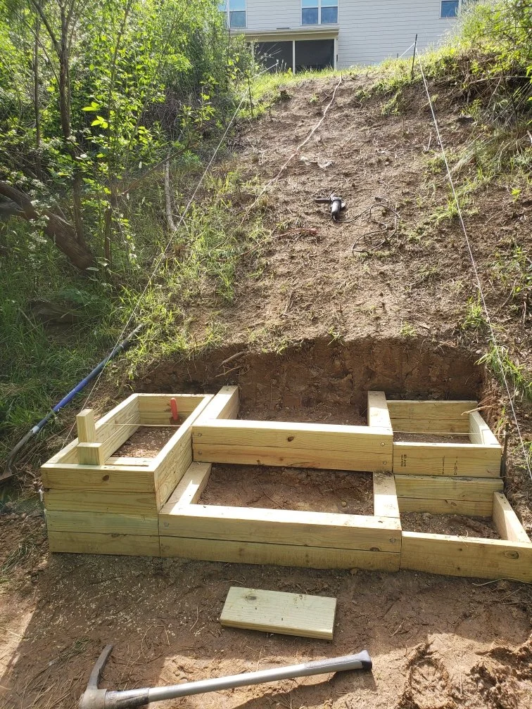
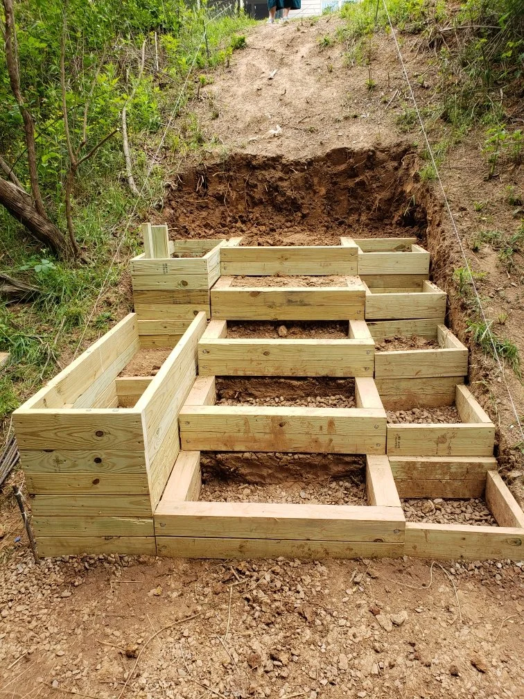
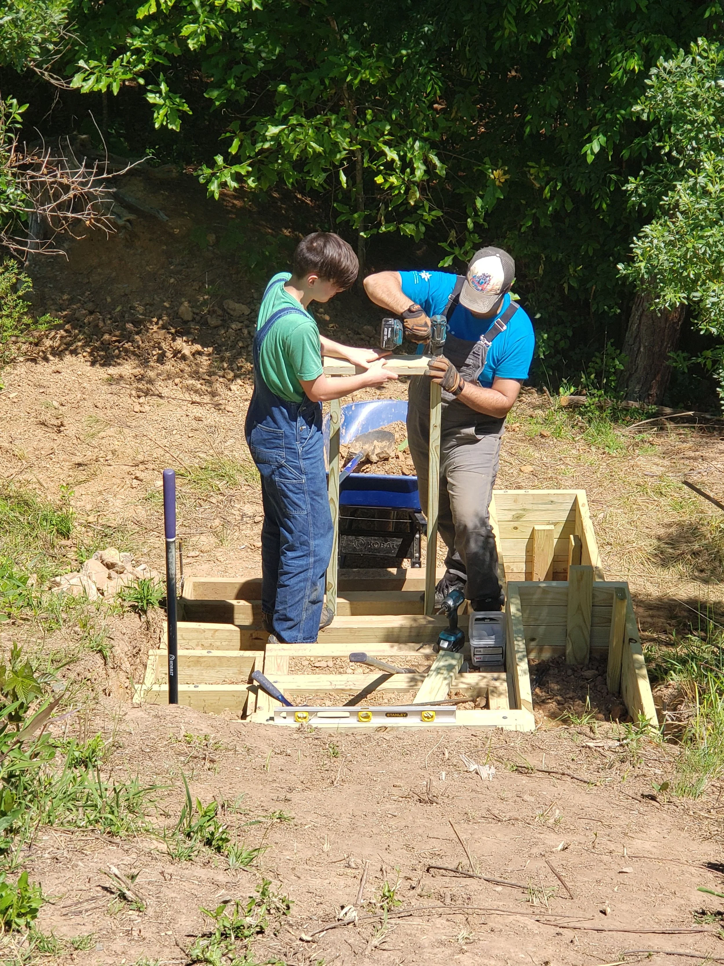
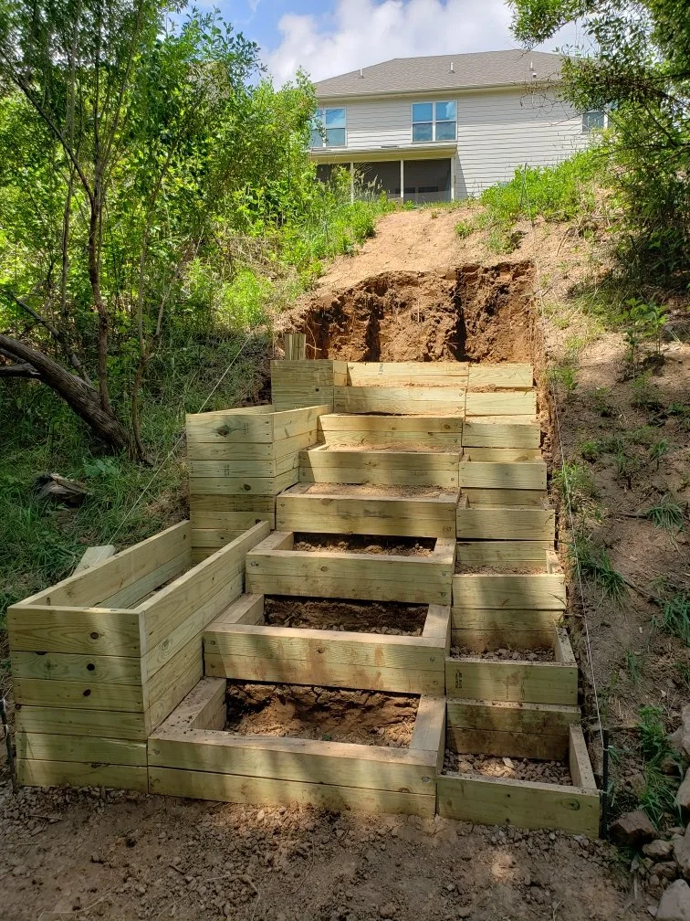
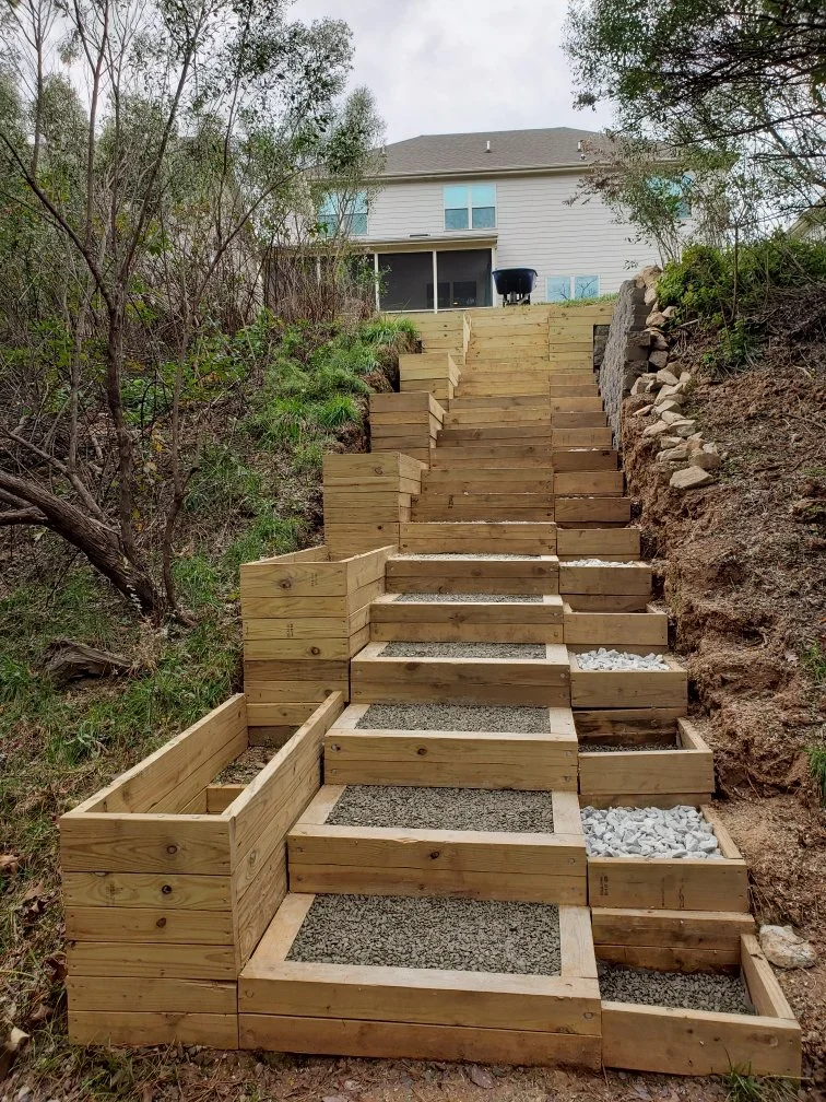
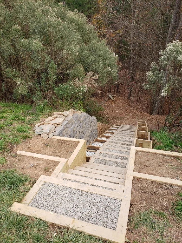
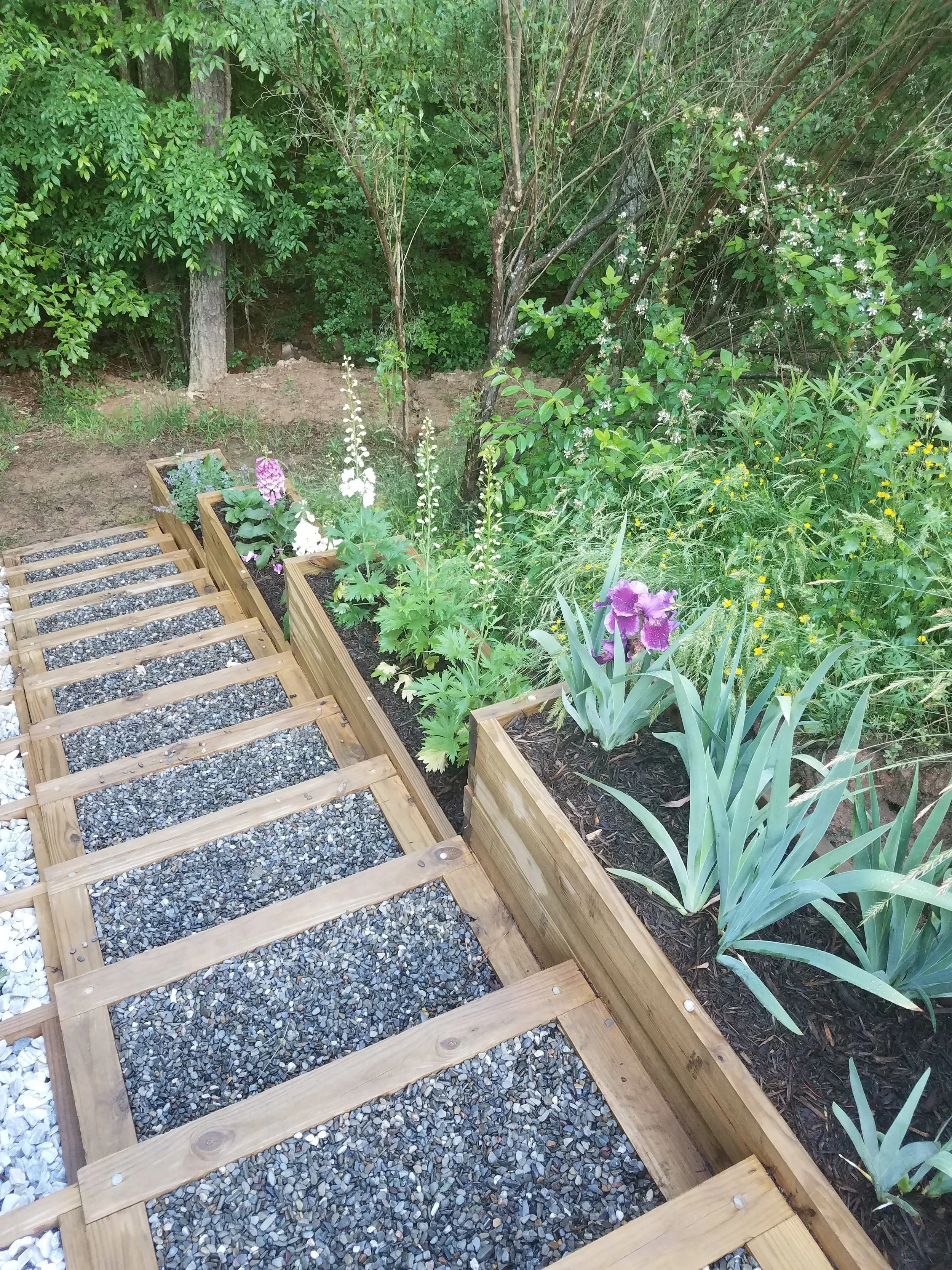
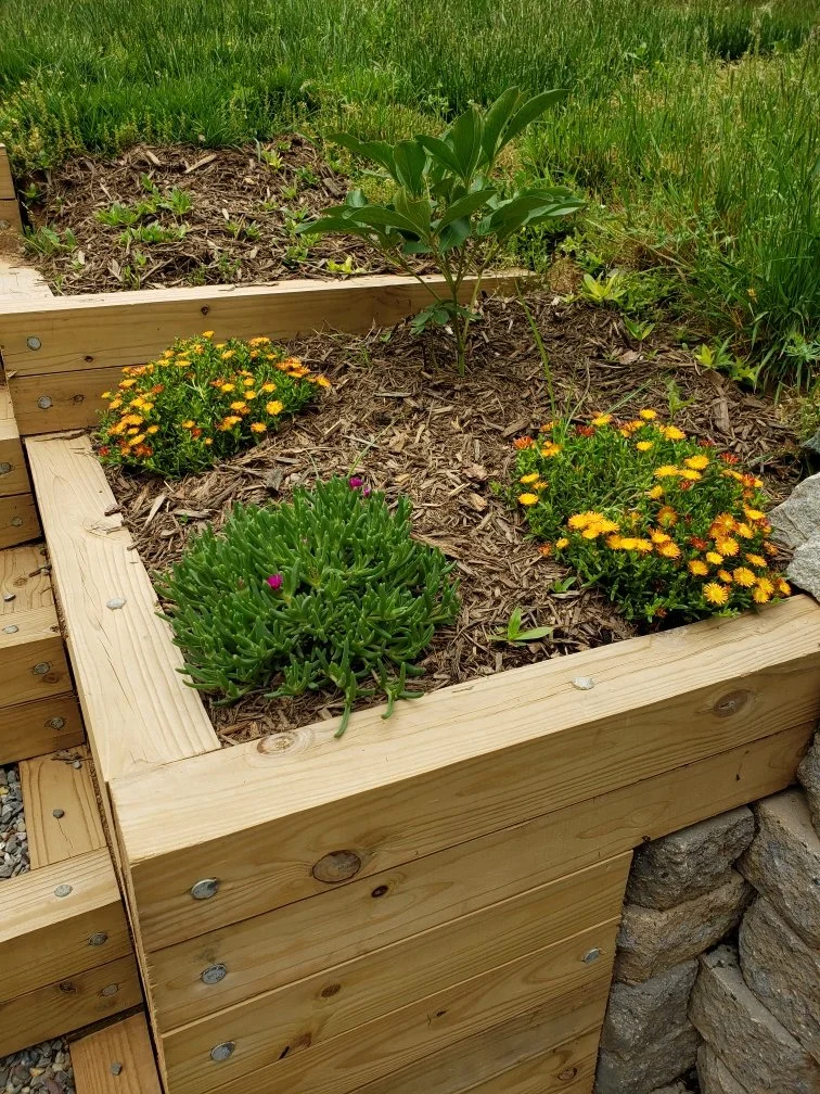
I designed this staircase to go down a hill in our backyard for my parents. I wanted to create something that was simple but beautiful, with lots of space for gardening. I’ve always been drawn to asymmetrical things and knew that I wanted the staircase to have many asymmetrical aspects. I chose to use different sizing for the planters on either side of the steps. The larger planters would take up the length of three steps, and the smaller would be even in length with the steps. After coming up with my design, I worked with my father to plan out structural details like the need for a retaining wall towards the top of the hill, and to plan out how we were going to build the steps. Each step is made of 4x4 in. lumber stacked in groups of two and attached with 3/8 in. galvanized spike nails in a short u-shape. The planters are made out of both 2x4 in. lumber and 2x6 in. lumber, with the former being used to create additional height asymmetry between the planters and the steps. We used a pickaxe and shovel to dig out the hill behind the steps, before constructing and adding the steps themselves, piece-by-piece.
02 - BOOK
2023
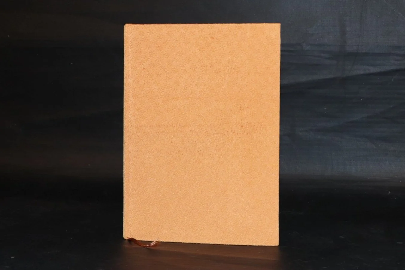
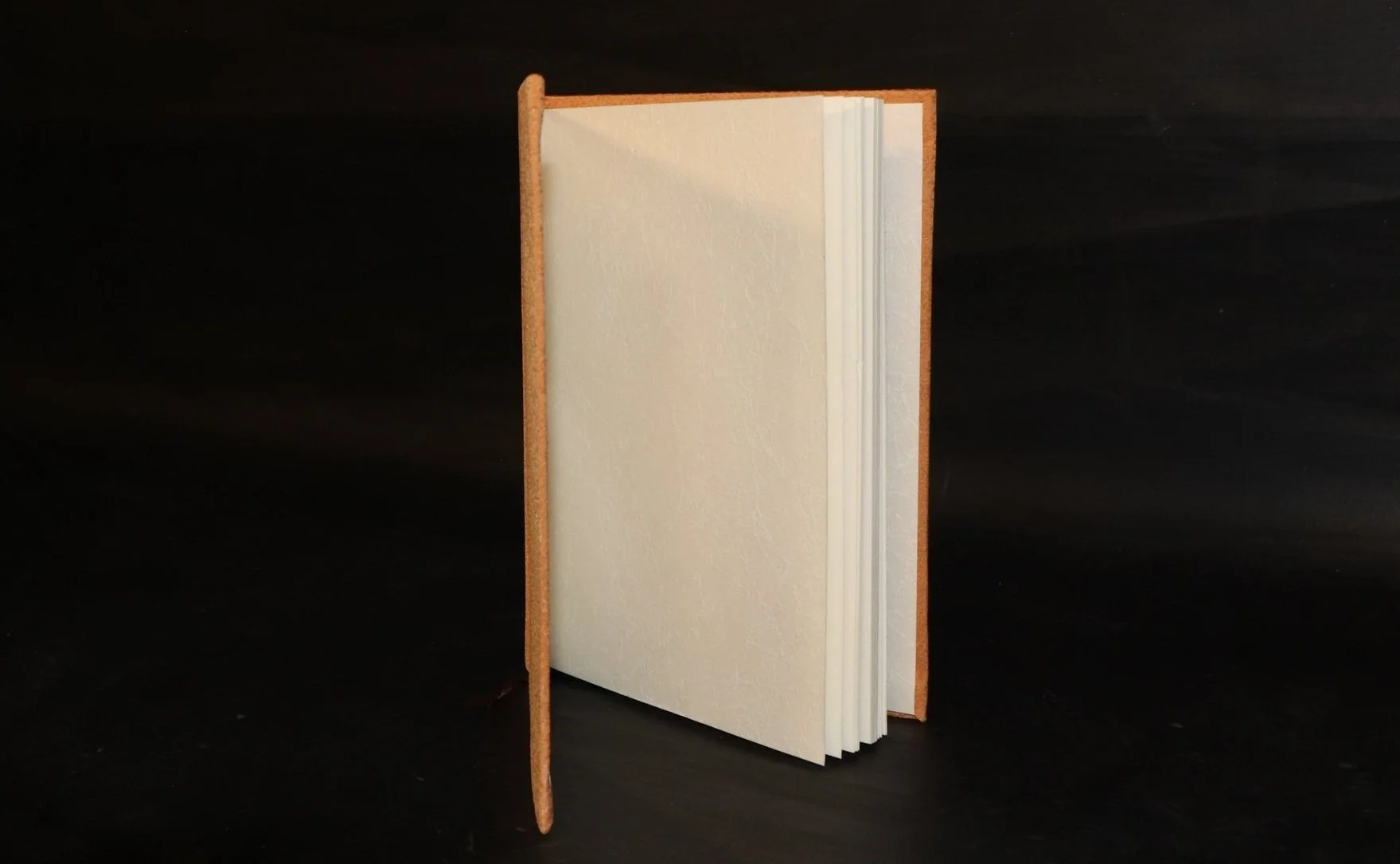
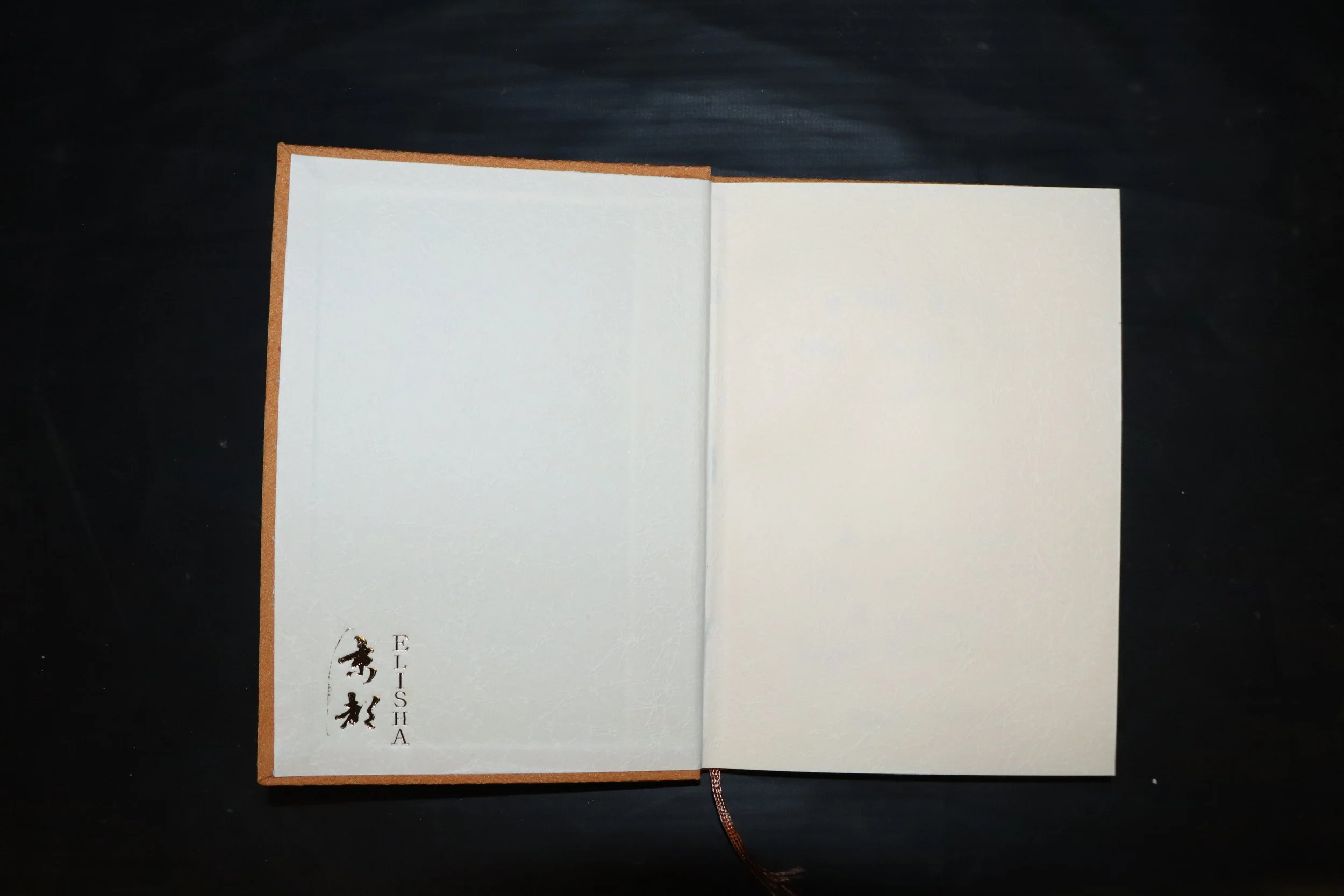
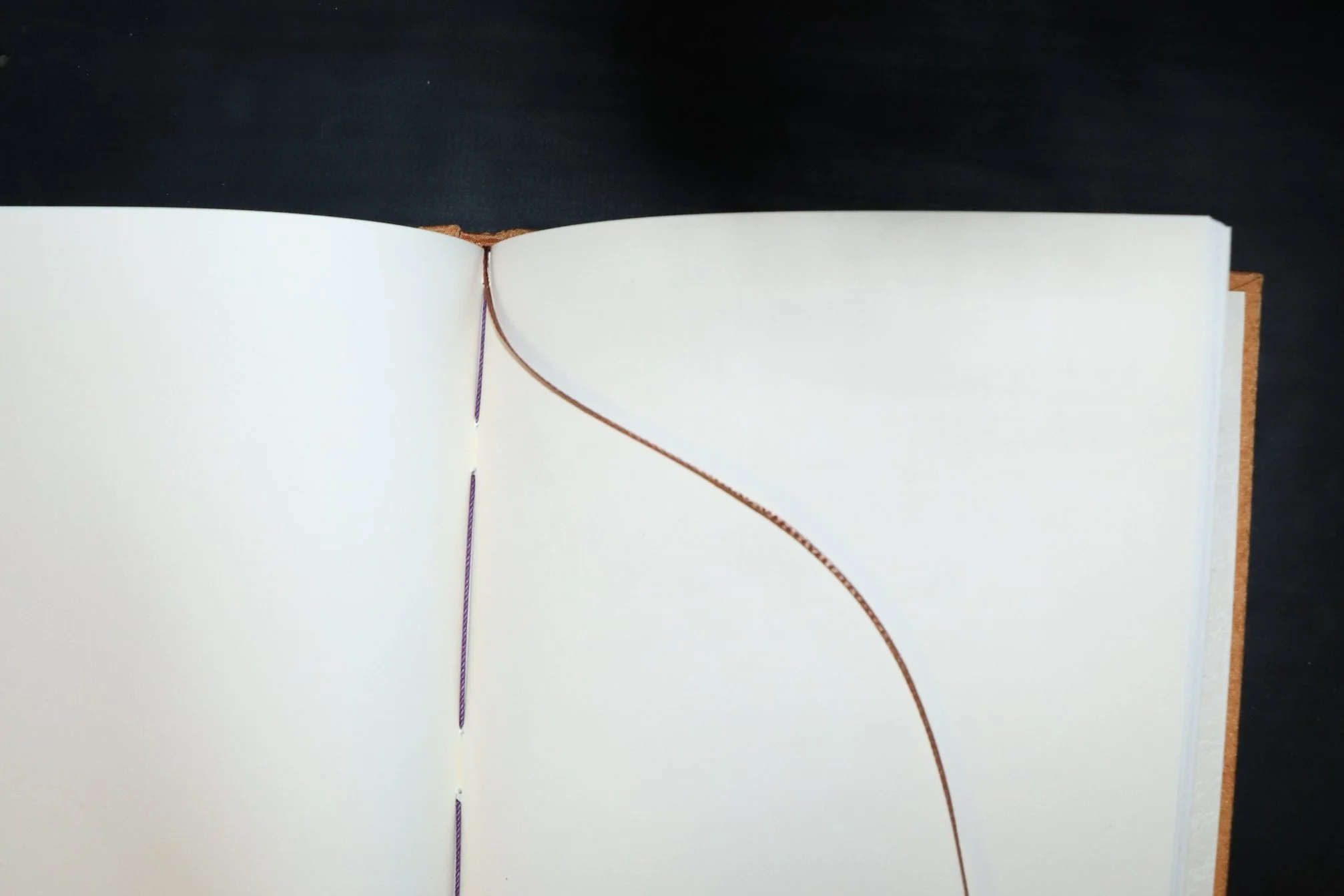
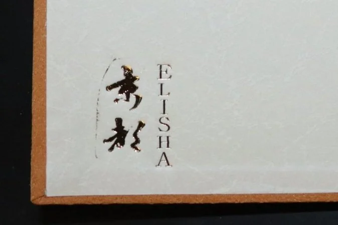
I made this book as part of a workshop on bookmaking. It is made out of a kimono, book board, high quality paper, rice glue, and a silk ribbon. I decided to use orange for both the kimono cover and the silk ribbon so that this book would be associated with feelings of joy and warmth. I intended for this book to used as a journal, and wanted to create positive associations with both the journal and the practice of journaling. I also chose to add gold detailing on the inside to symbolize the wealth of self-awareness and emotional well-being journaling can provide. The word for “Kyoto” is written in Japanese Kanji next to my own name, aiming to capture a place of peace, serenity and, livelihood—all things I associate with Kyoto—as the mood for each journaling session.
03 - POT
2023
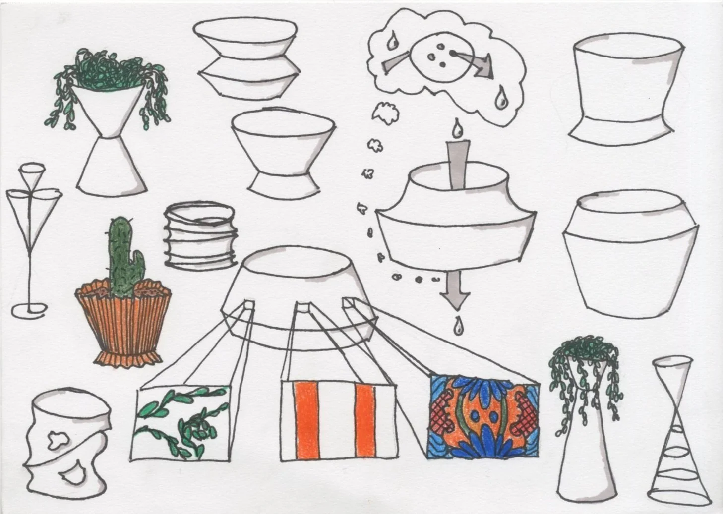
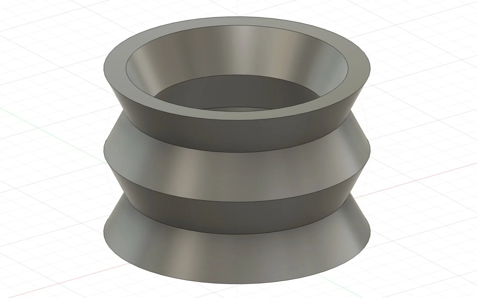
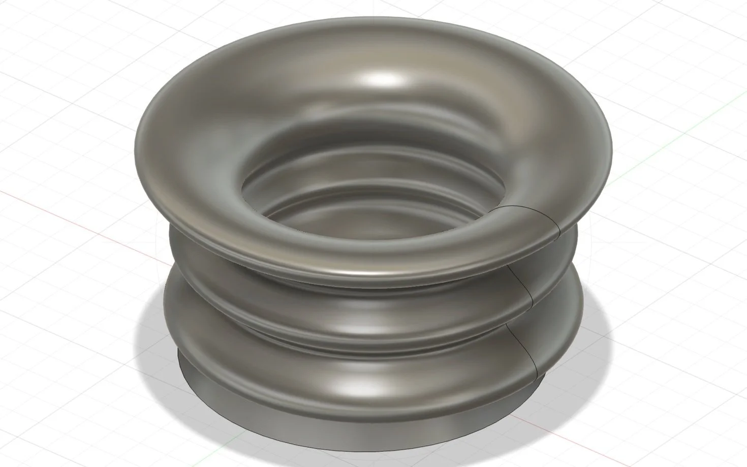
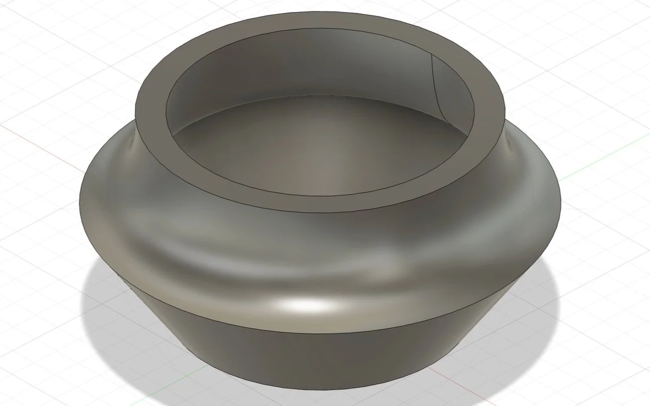
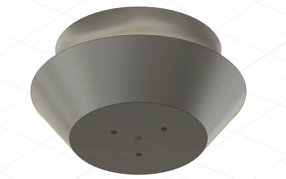
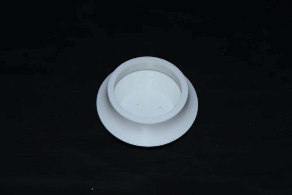
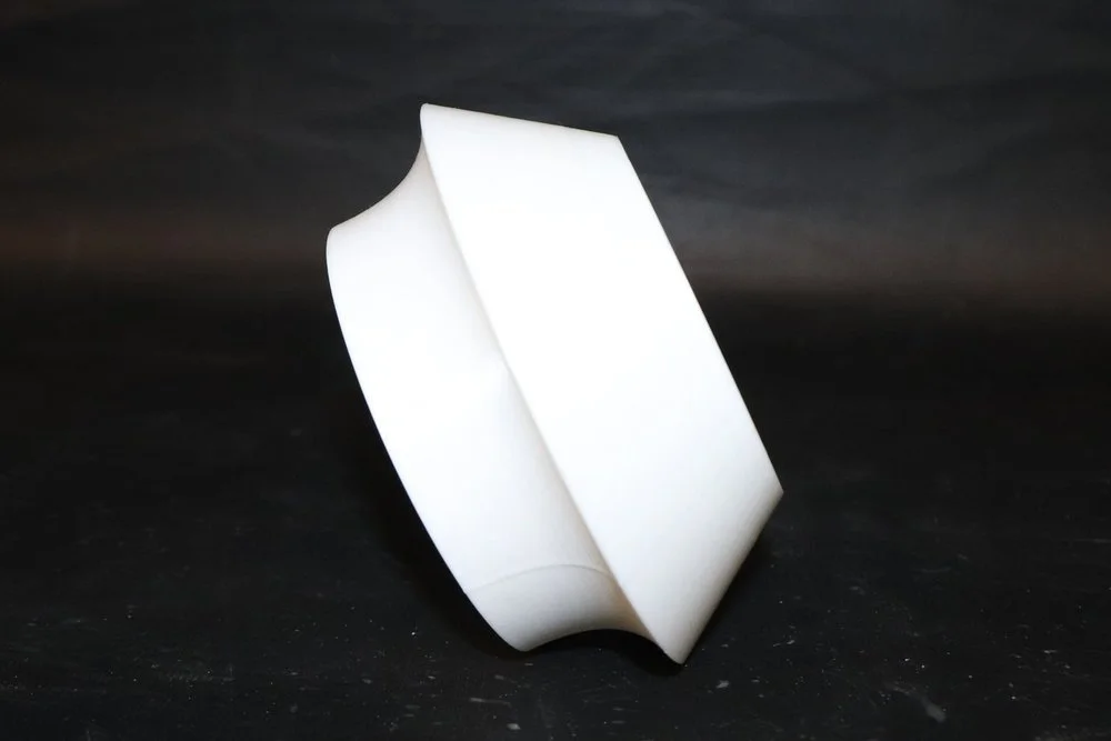
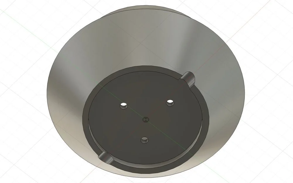
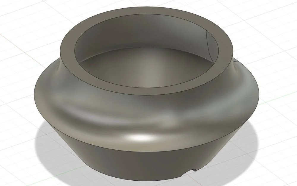
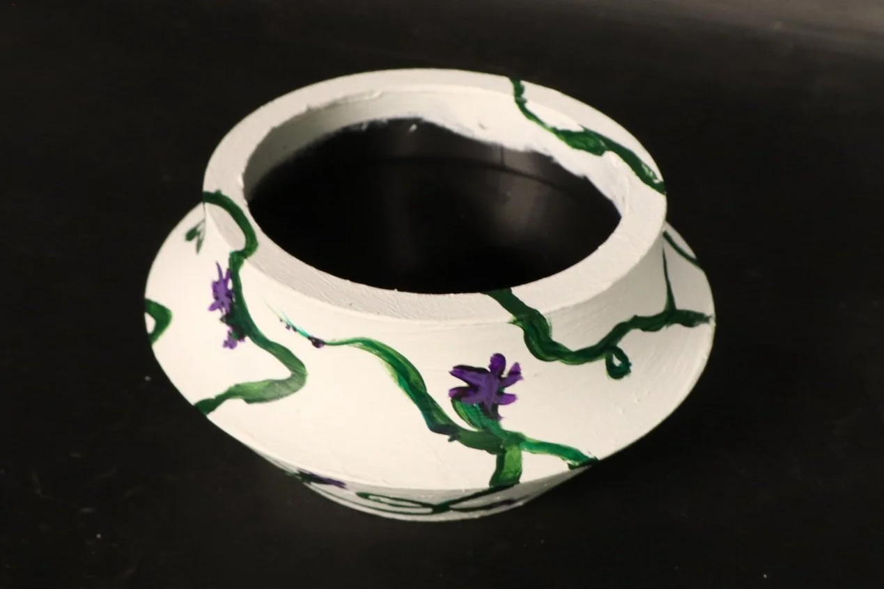
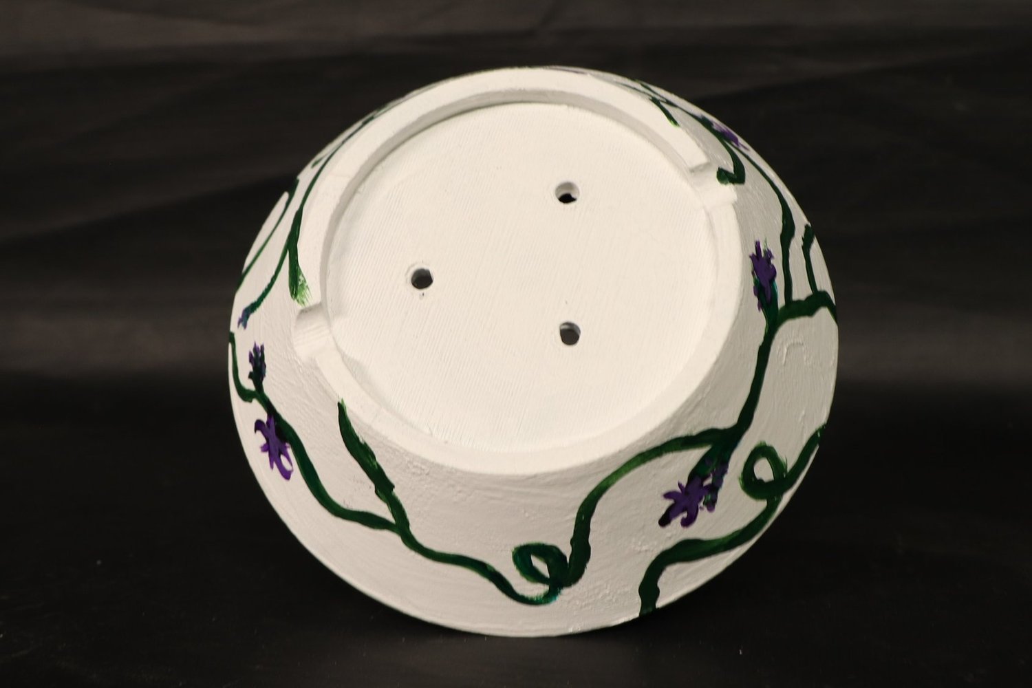
After amassing a large collection of house plants and a not so large collection of pots for said plants, I decided to create my own pots as a solution to the problem. I began ideating for my design, drawing inspiration from the shape of an hourglass. I experimented with designs that incorporated different types of lines and lips, before settling on a design that is angular at the bottom section and curved at the top section. I was really drawn to the juxtaposition this created in the pot design and was intrigued to see how a sprawling, vine-like plant would interact with the pot. I designed the shape of the pot in a CAD software with the needs of plants in mind. I wanted drainage holes in the bottom, putting these in the shape of a triangle to represent the strength found in nature. After seeing a first prototype 3D-printed, I identified things I wanted to change. The drainage holes needed to be bigger, the bottom of the pot needed a lip to allow the drainage holes to function, and there must be gaps in this lip in order to prevent creating a vacuum-like water trap. After the second print of the pot that incorporated these changes, I painted the pot a base white with a vine and floral pattern overtop. This pattern reflects the intention behind this project—that it would be a vessel to house and amplify nature, and allow easy access to nature in my own home.
04 - LAMP
2023
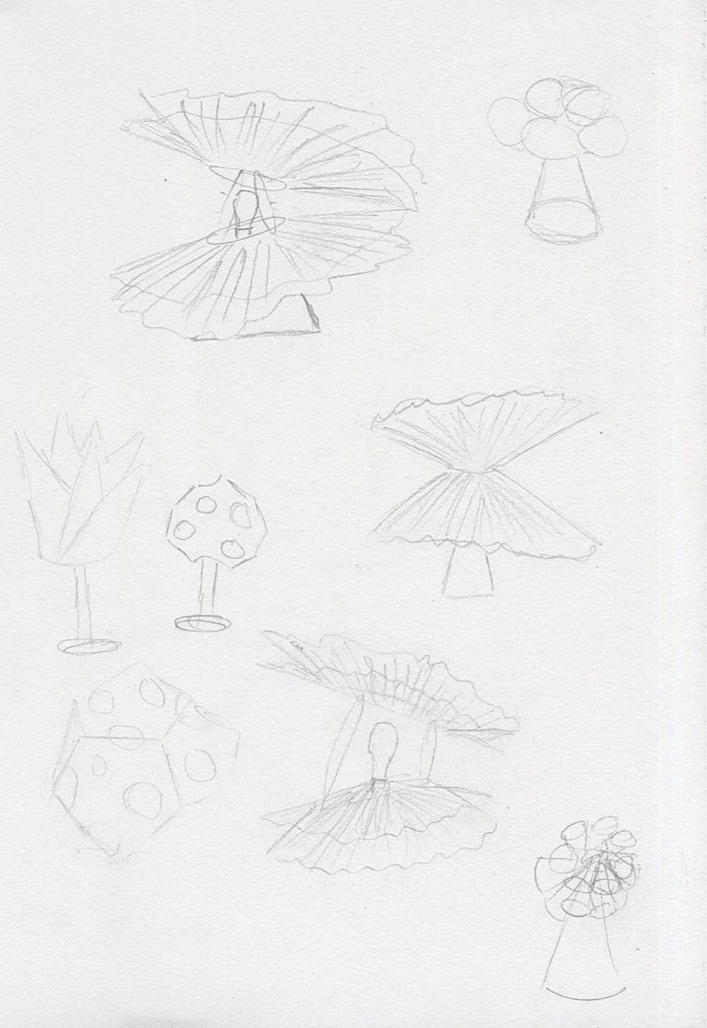
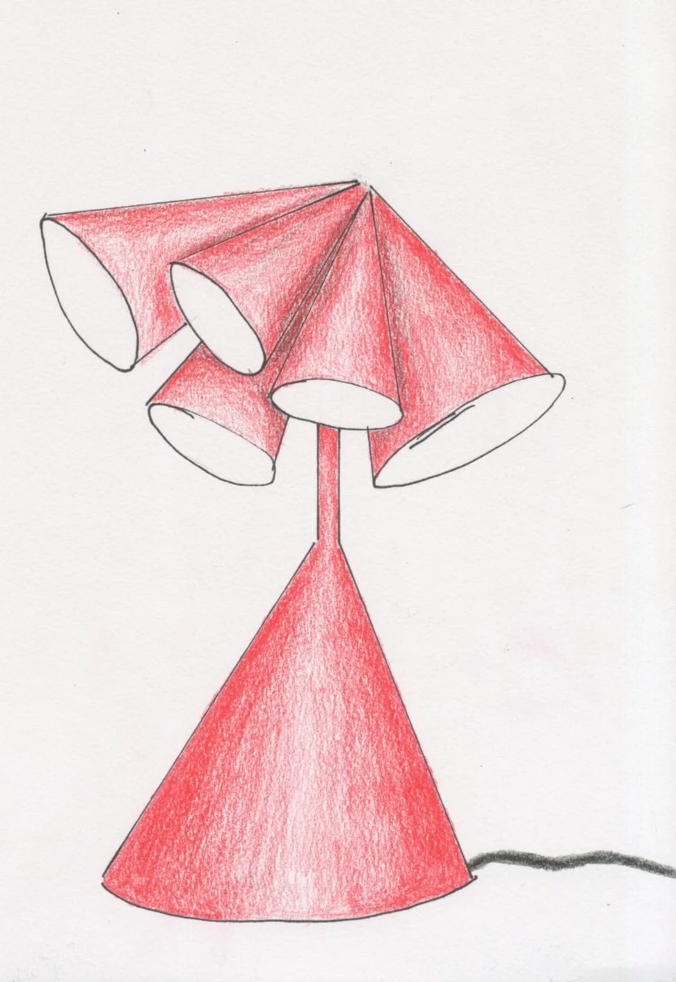
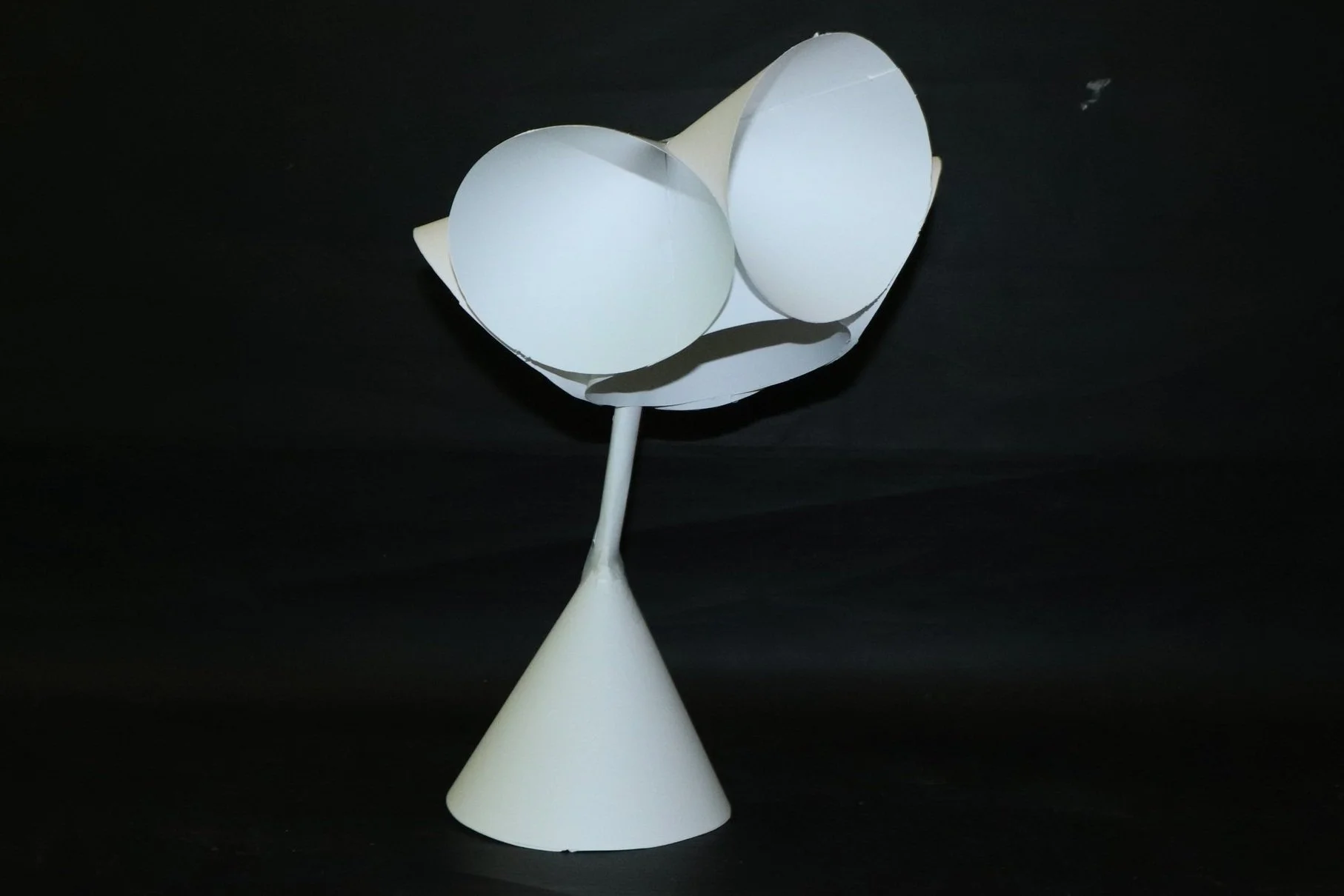
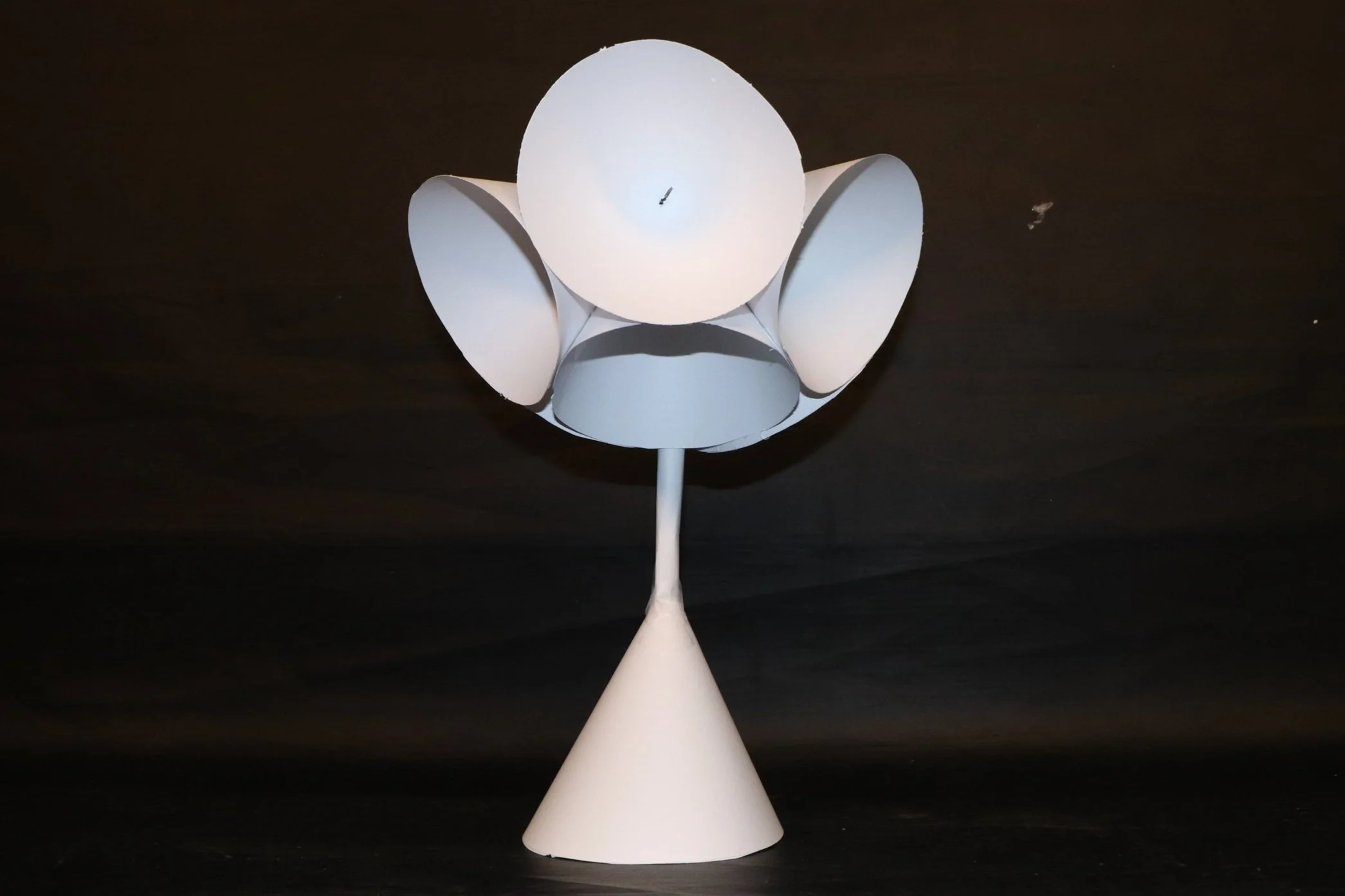
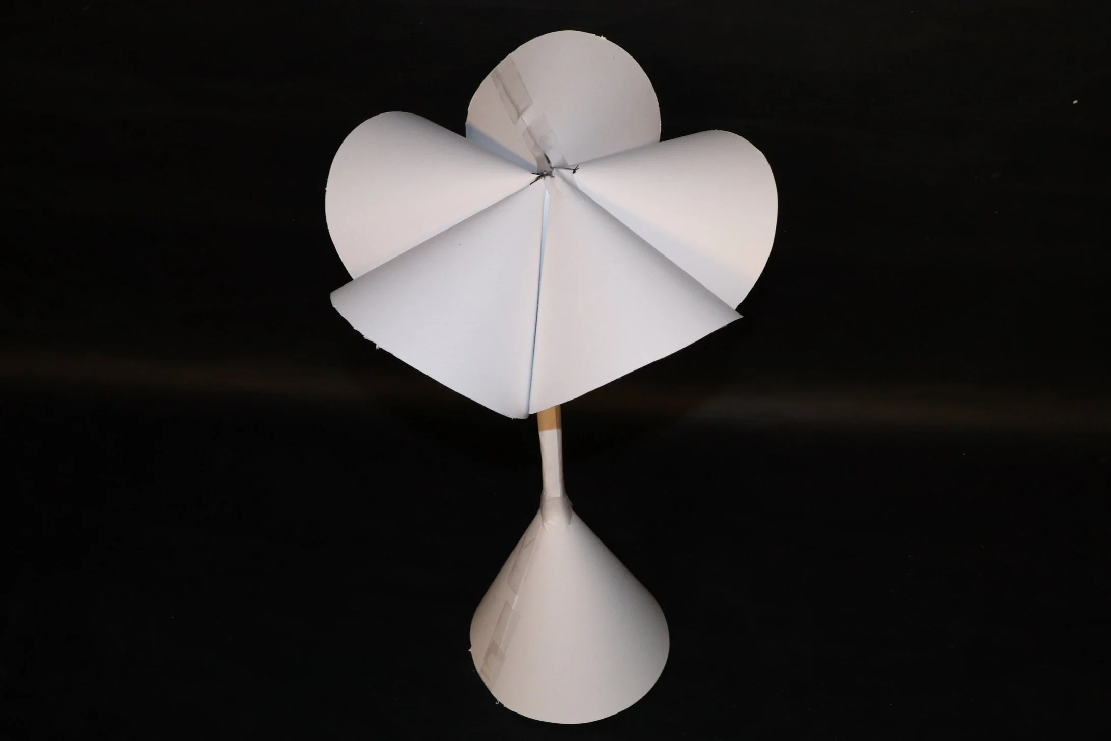
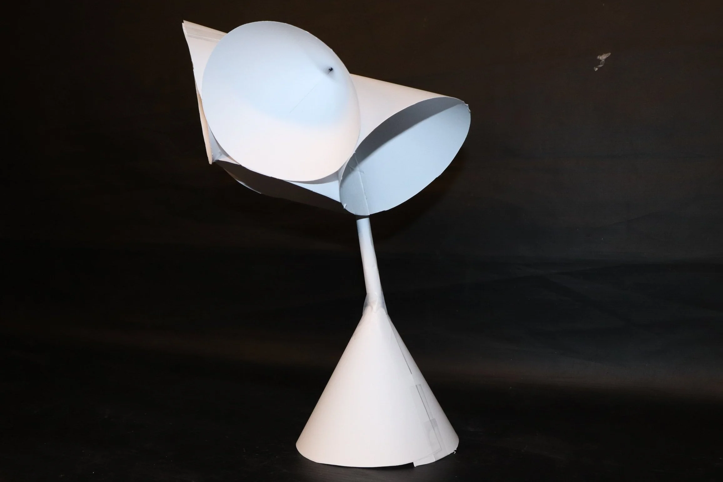
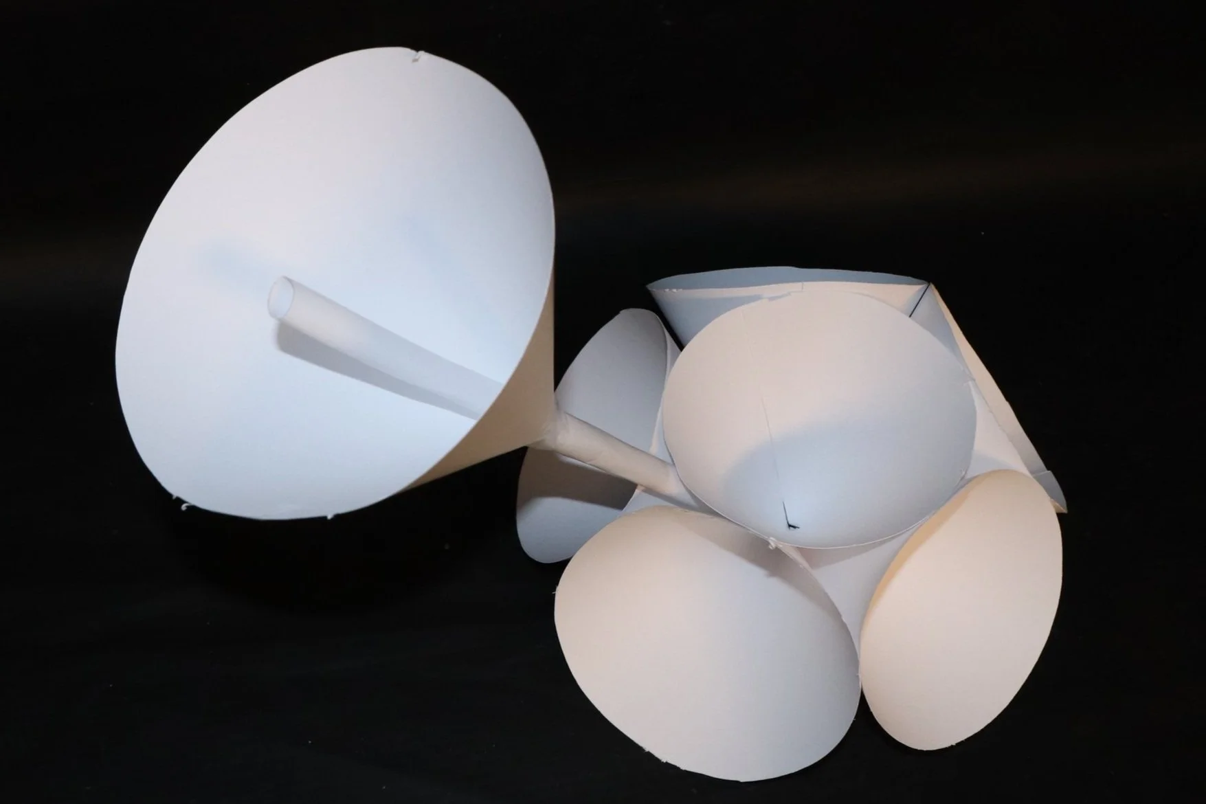
I designed this lamp during a time where I felt overwhelmed with the amount of work assigned to me. I had many different projects going on at the same time, and so I designed this lamp with my overwhelming feelings in mind. I gave the lamp many different bulbs and lamp shades pointing in different directions to demonstrate the feeling of having too many “tabs” open in my head. I chose to give the lamp a red color in my sketch because red is a strong color that can represent many emotions; anger, courage, love, passion, and sacrifice t name a few. I then made a prototype of this lamp out of paper, starting with seven cones of equal size. I sewed the top six meant for the lamp shades together. I then rolled a paper cylinder to serve as the lamp shaft that I attached to the final cone base. After surprisingly little tape, the final shape of the prototype was created and held in place.
05 - MILK CARTON
2023
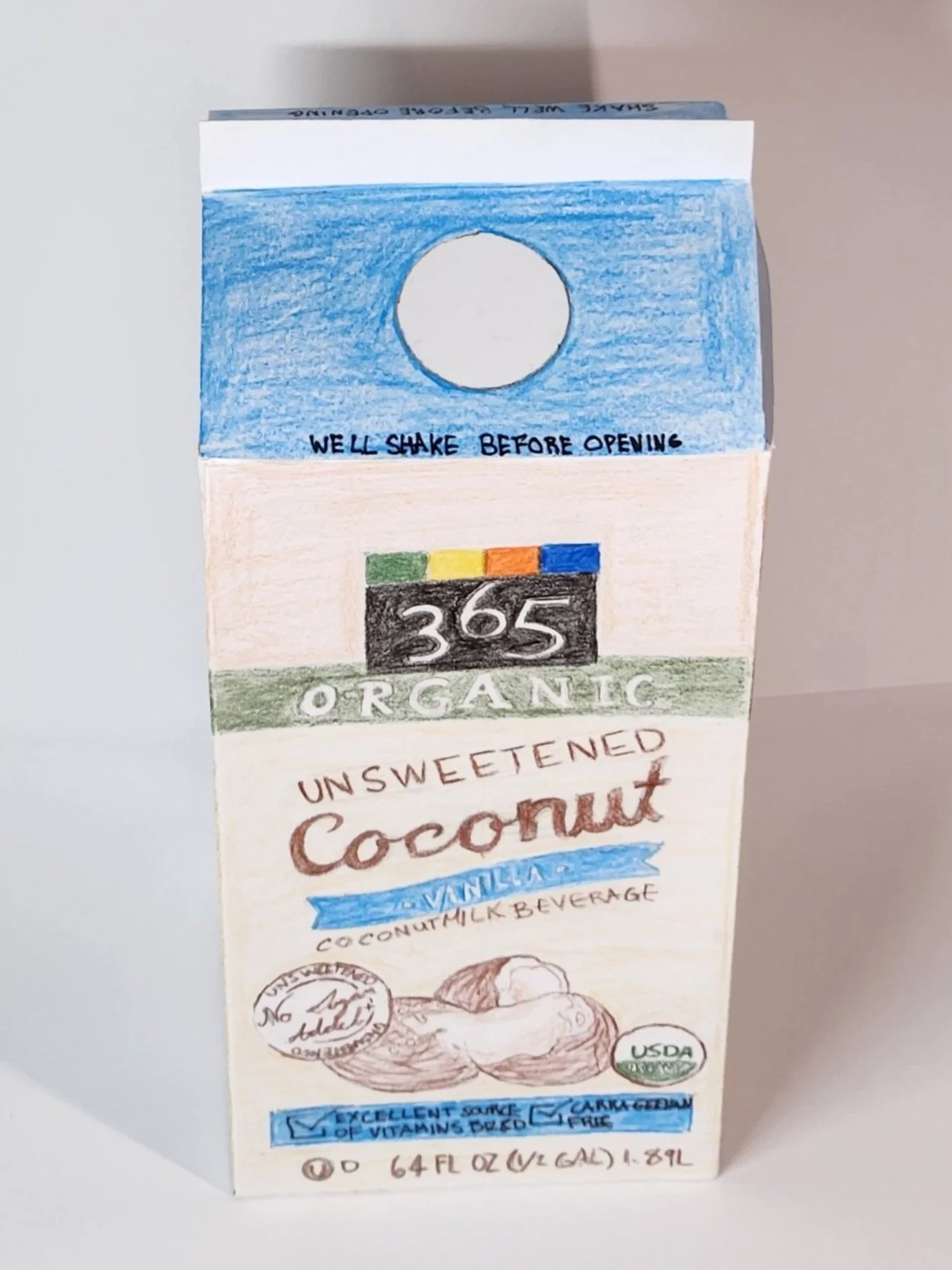
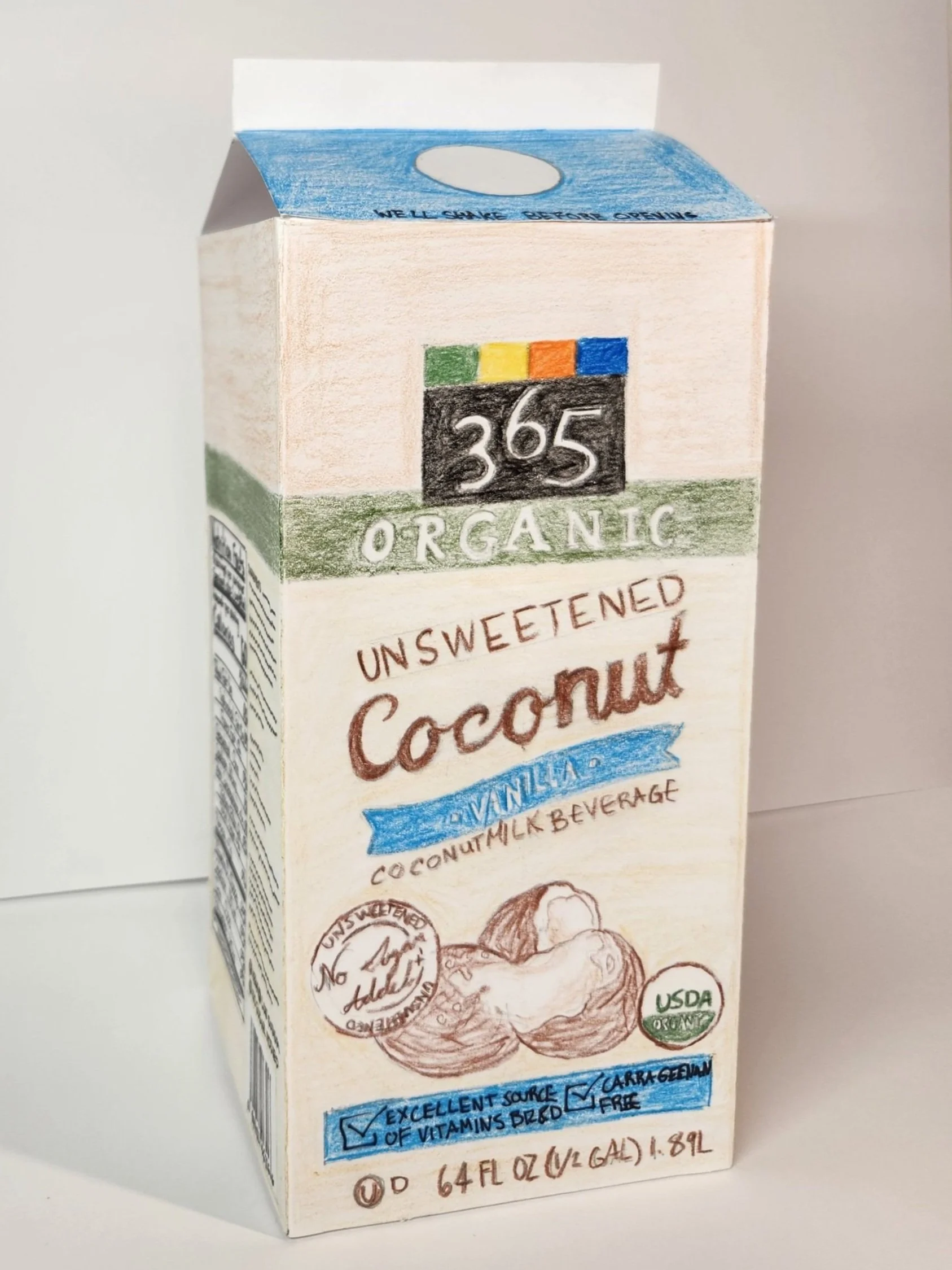
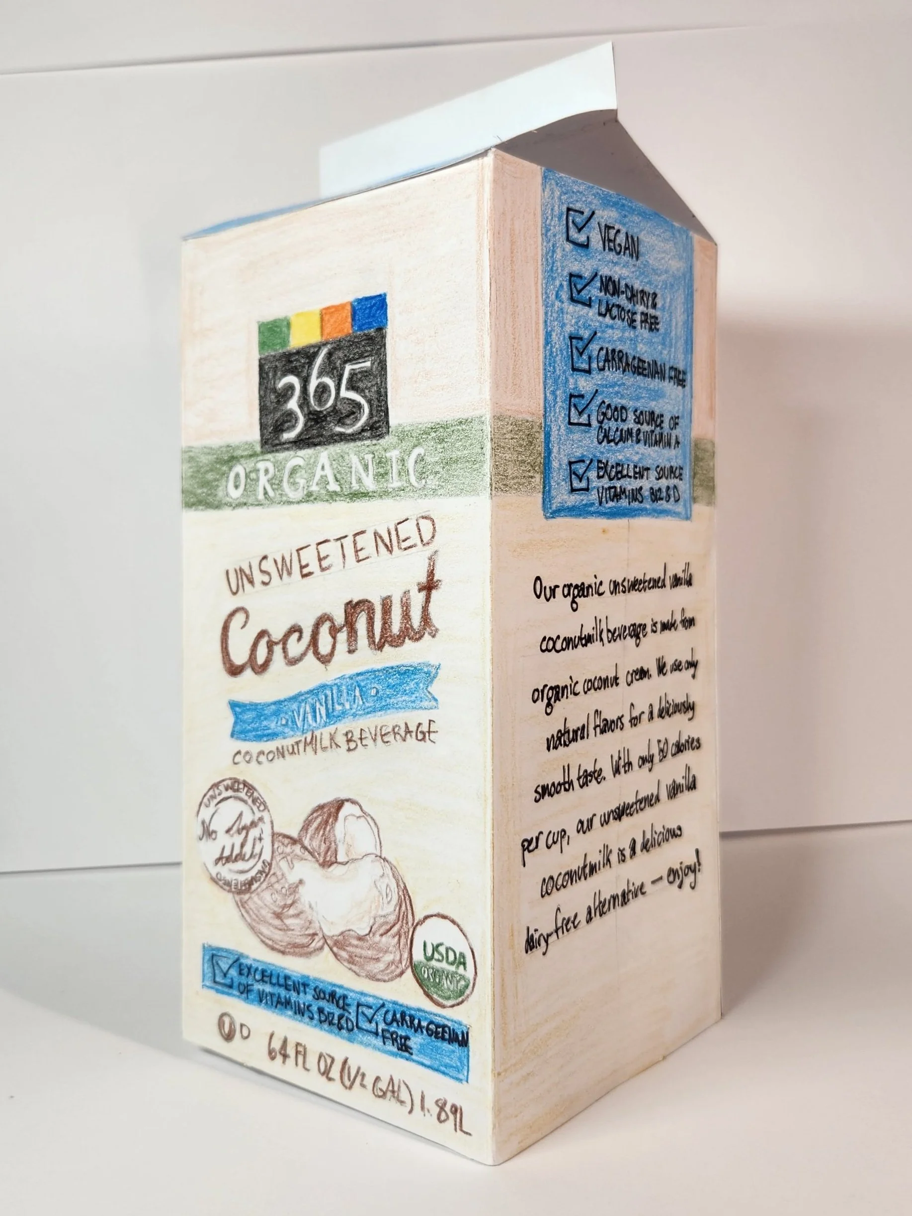
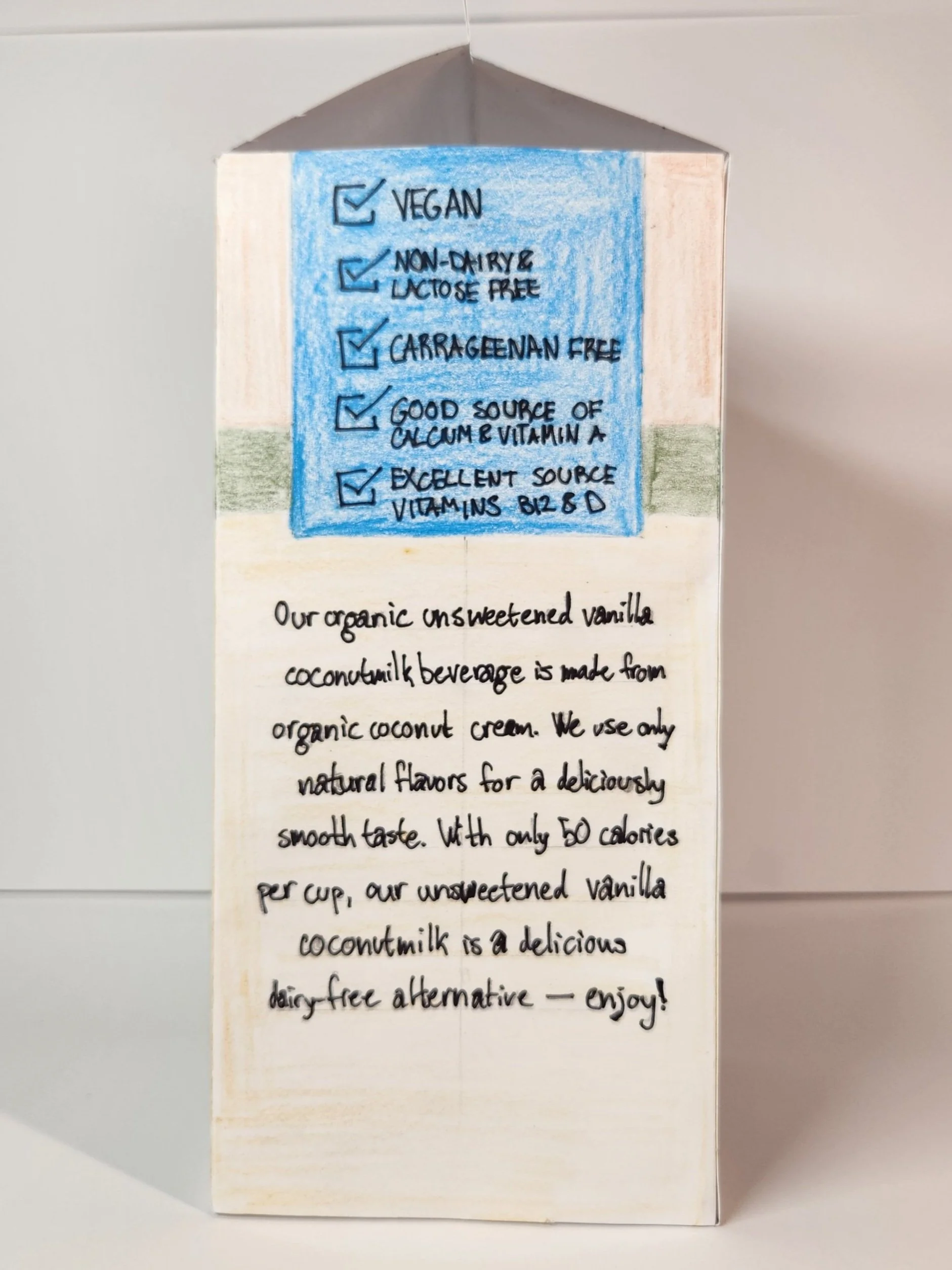
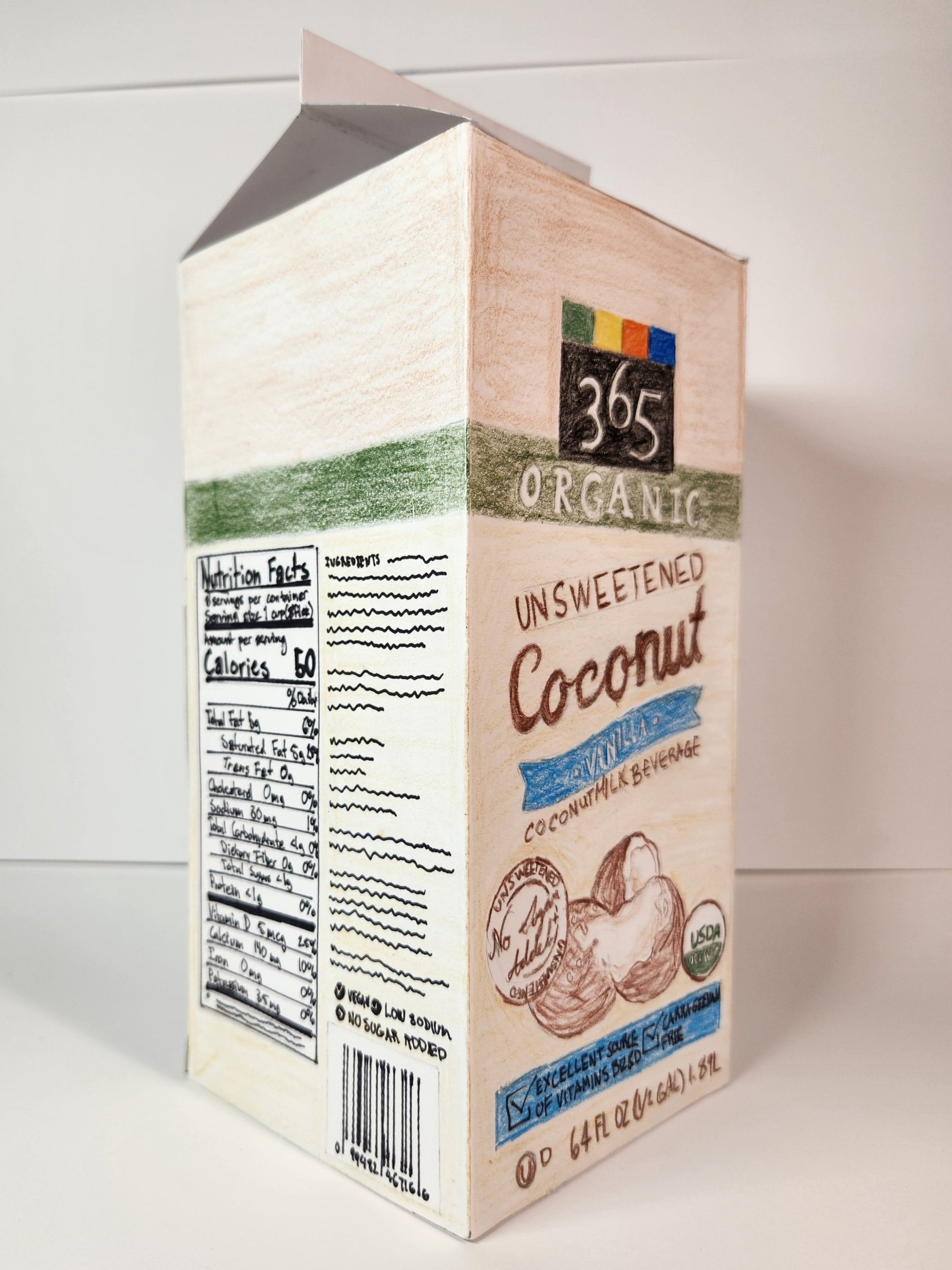
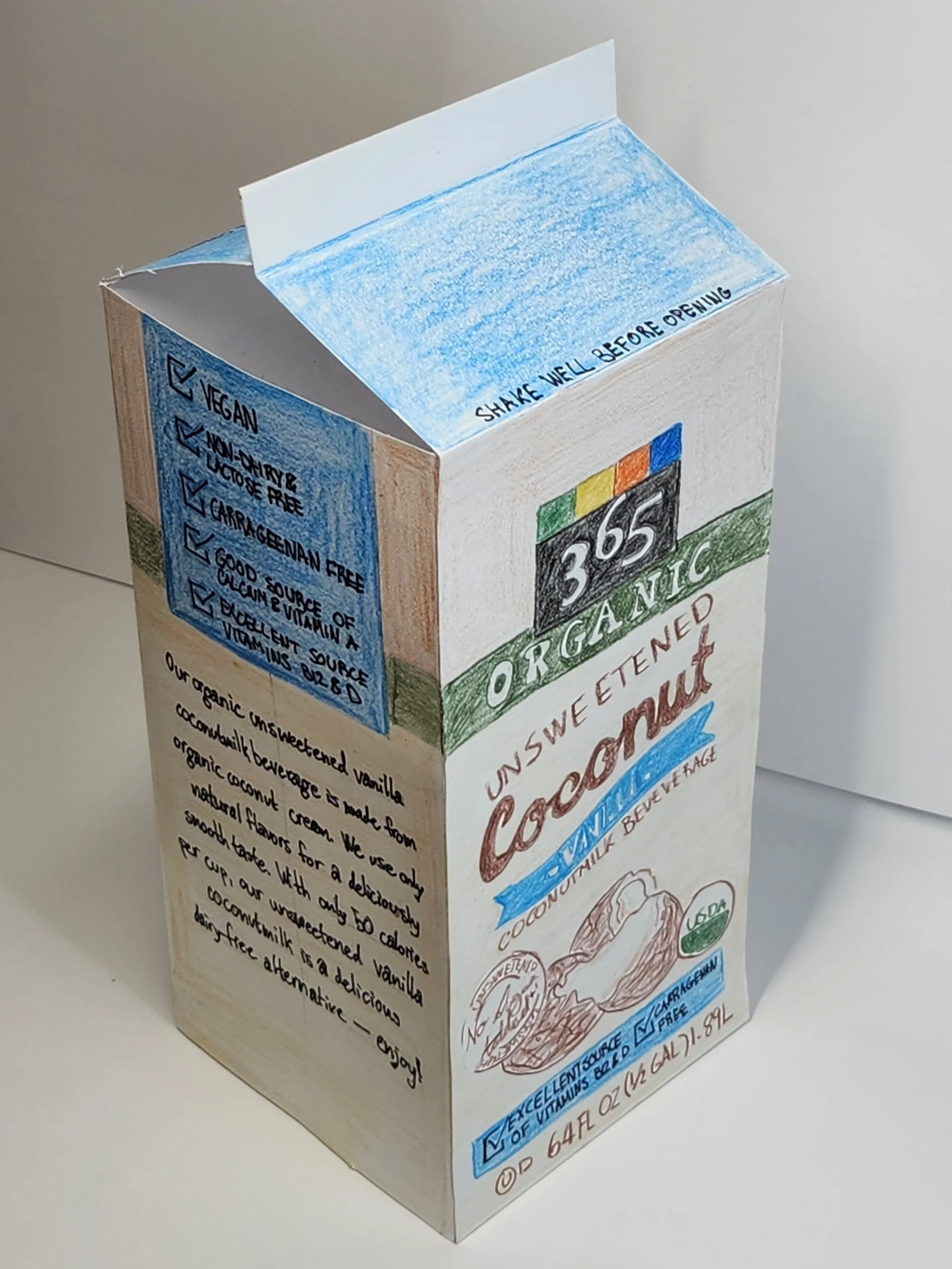
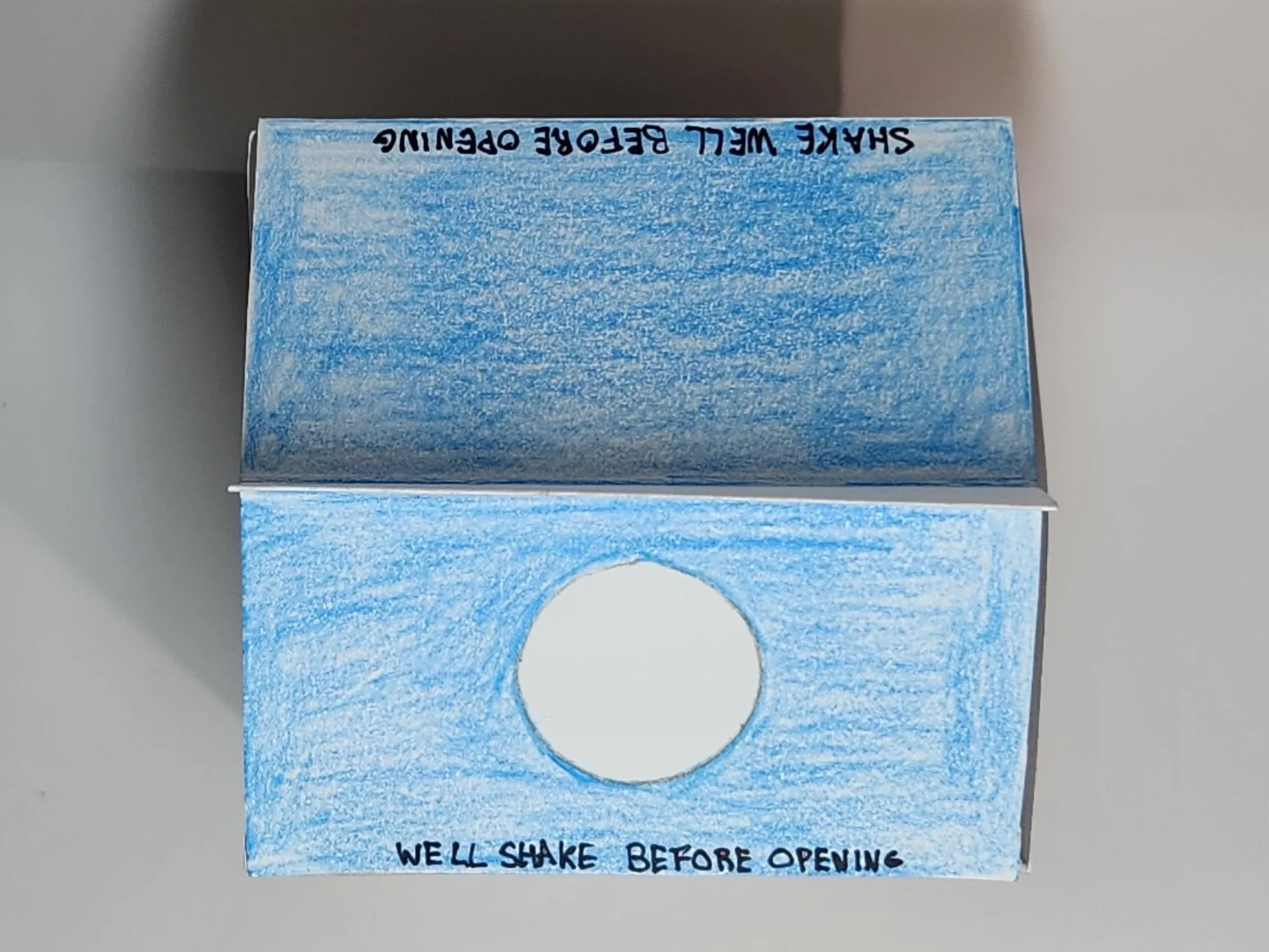
I was tasked with replicating a milk carton out of paper by my professor. The goal of this project was to gain an understanding of the assembly and composition of three-dimensional everyday objects. I learned how to use geometry to accurately and efficiently build objects that serve as prototypes or as final products. I made a point to be exacting in my construction of the milk carton, so that everything would come together with nice, crisp lines, and to avoid any strange overlaps or disproportionate sides.
06 - WATERMELON
2018
reworked 2023
I drew this watermelon at a time when I felt out of place. I wanted to create a piece of art to show how I felt. I looked around and the first thing that caught my eye was the watermelon sitting on the kitchen counter. I removed the watermelon from the kitchen and set it down in the nearby bathroom sink. This sudden and unexplained movement to such an unusual place mirrored how I felt after a trans-continental move that landed me in North Carolina. I drew this watermelon with charcoal drawing pencils, choosing not to add chroma because I thought it would distract from the focus on the watermelon and its location. In fall of 2023 I reworked this piece, really challenging myself to explore a full range of color values that would emphasize the contrast in the piece. I wanted to emphasize contrast specifically because of the initial contrast I felt existed between me and my surroundings both at the time of original creation (2018).
07 - BEDSIDE STEP
2023
Made in collaboration with Ariel Lippy (aalippy@ncsu.edu), one of my friends also attending NCSU, who is pursuing her BS in Aerospace Engineering.
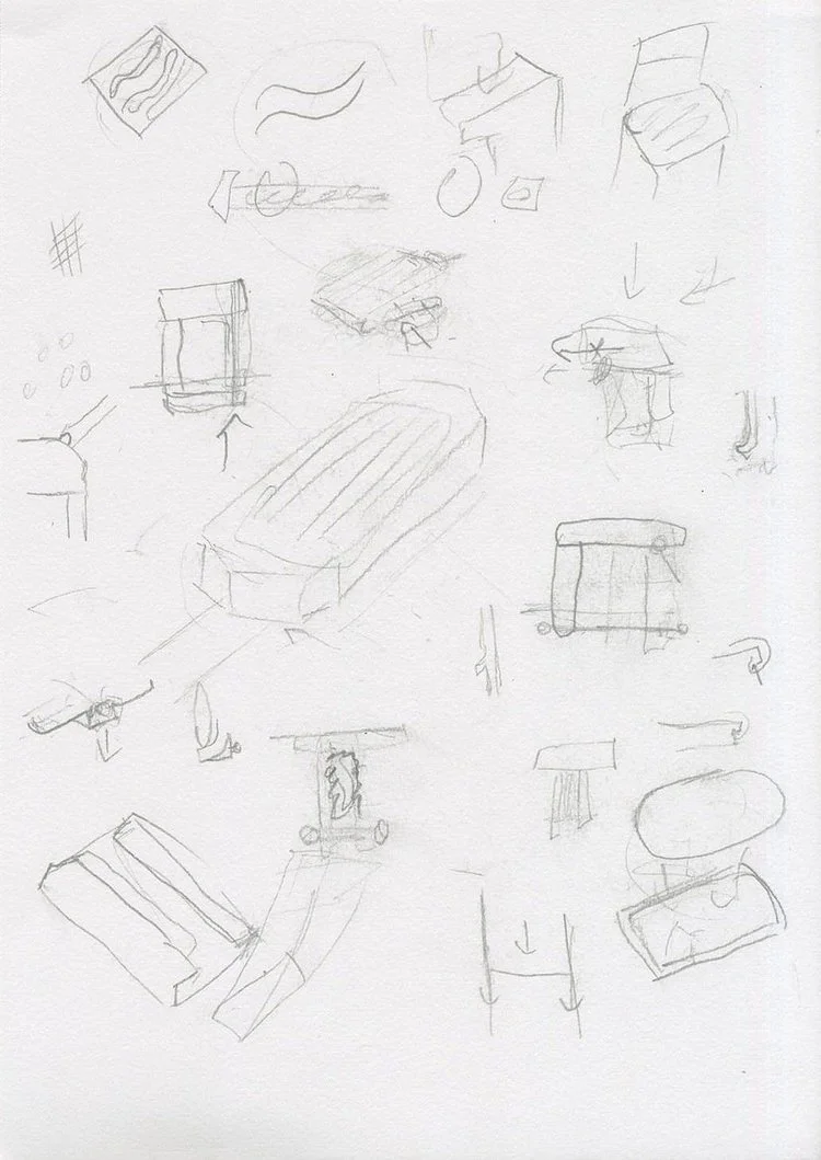
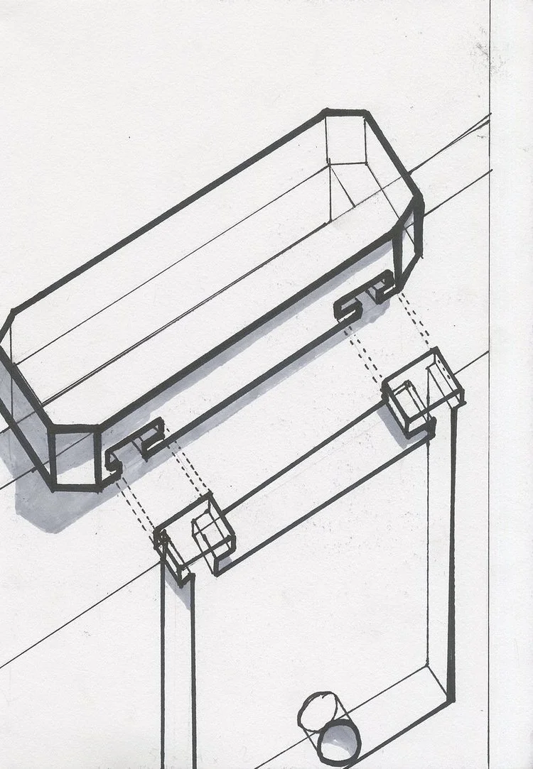
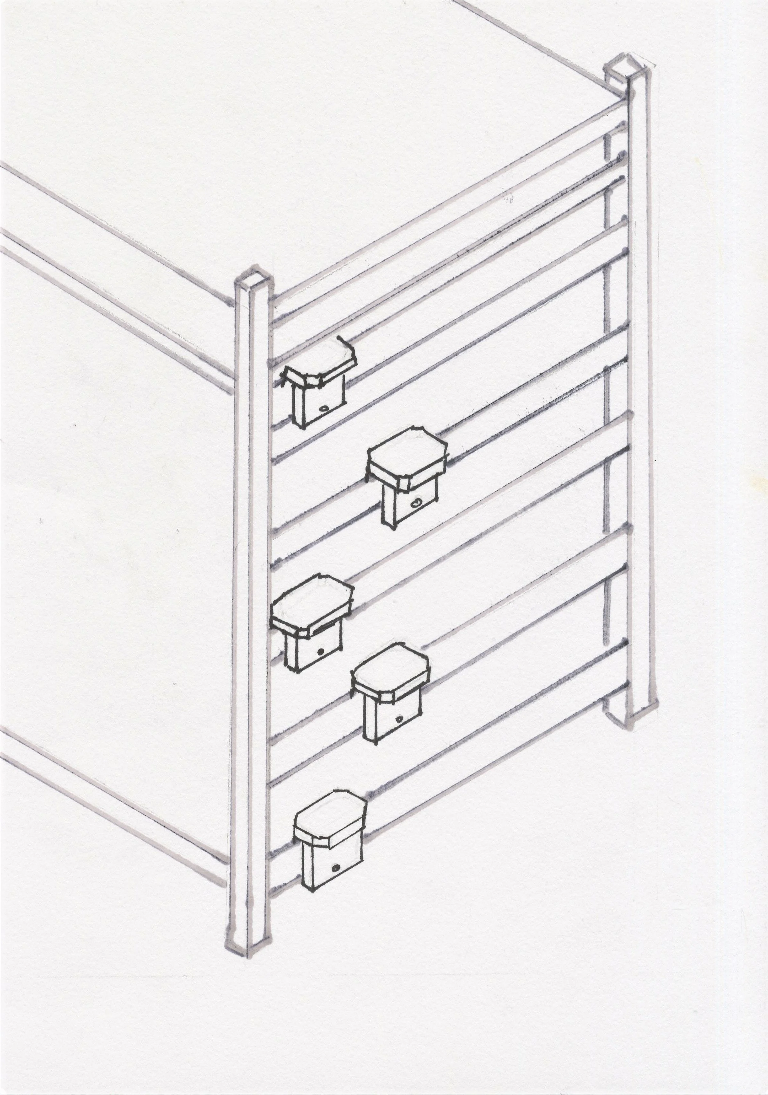
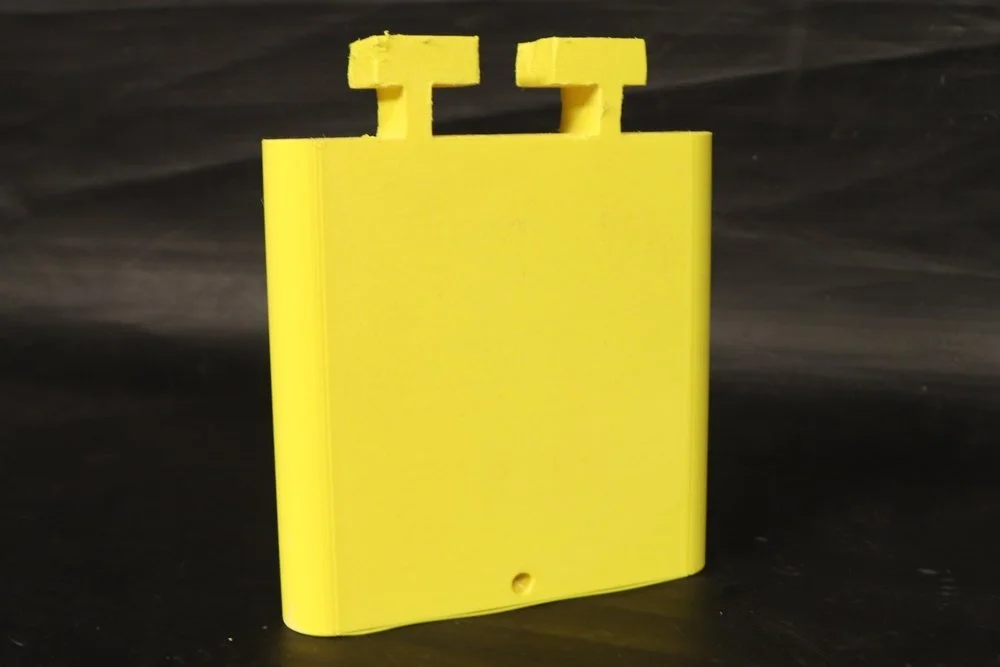
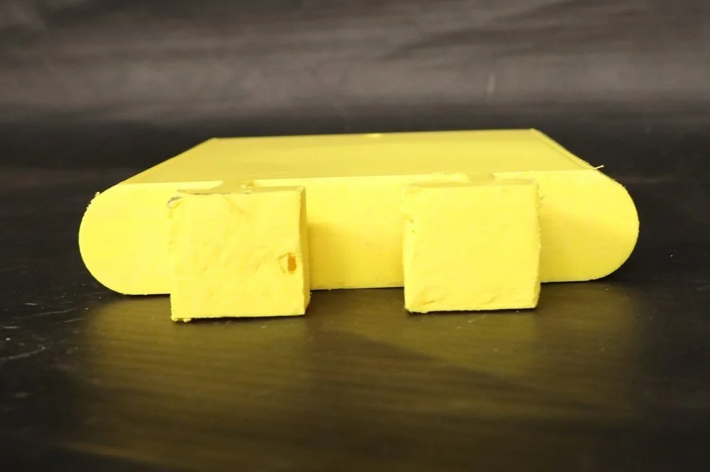
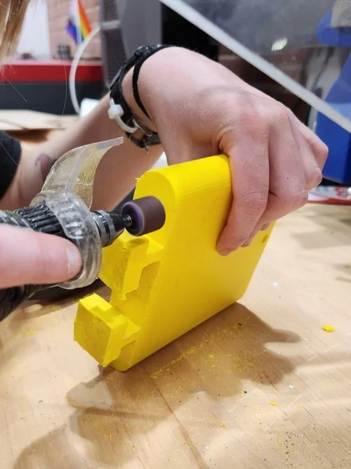
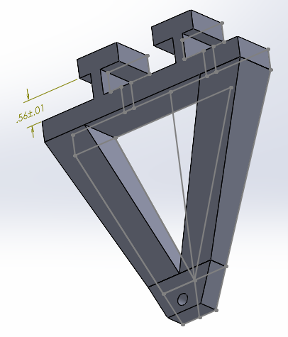
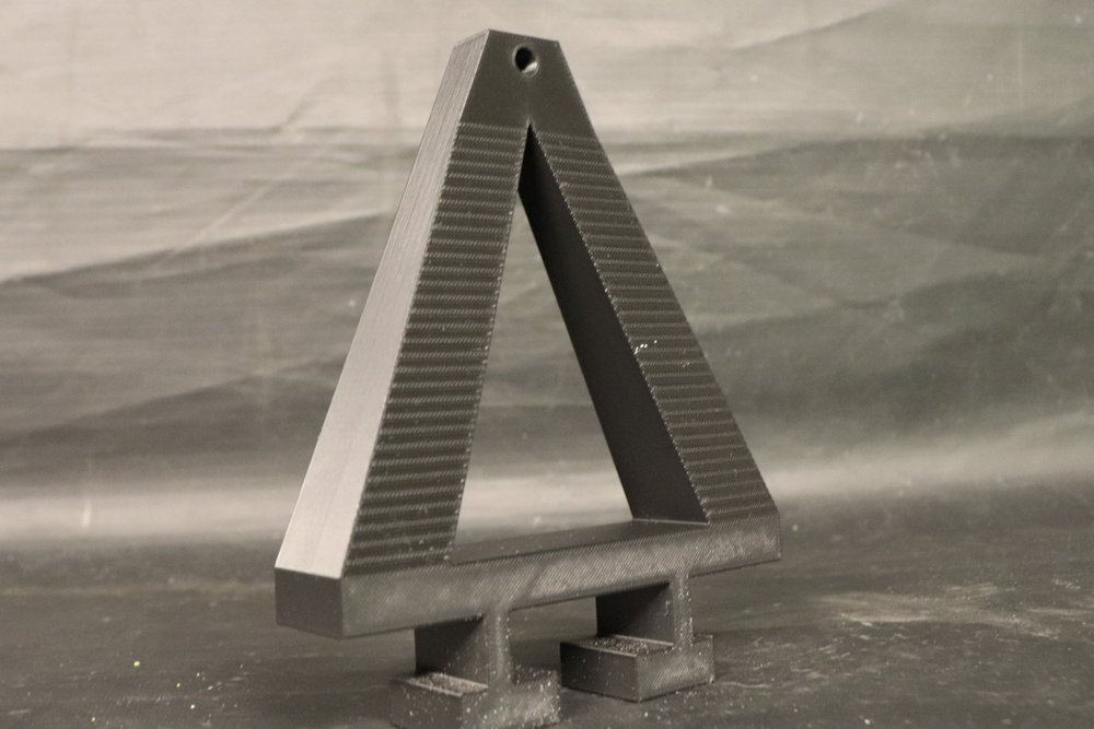
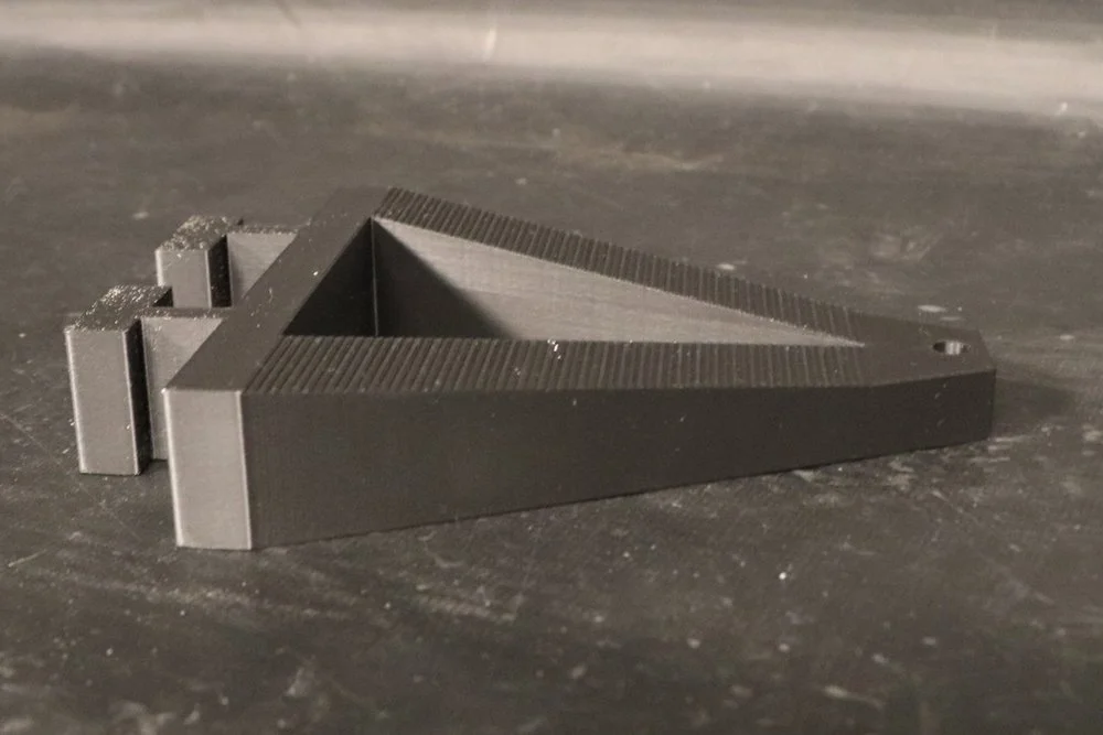
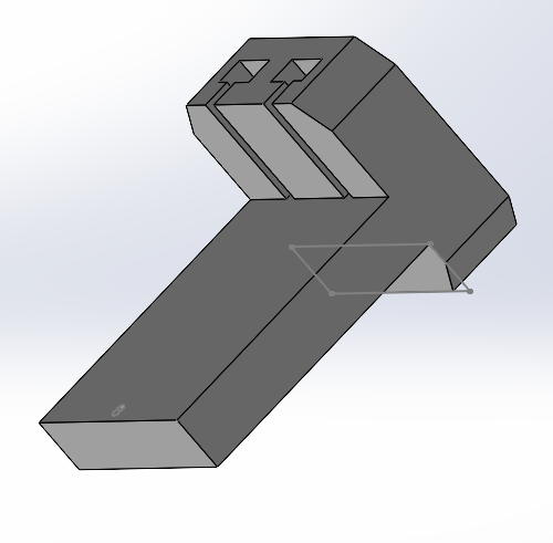
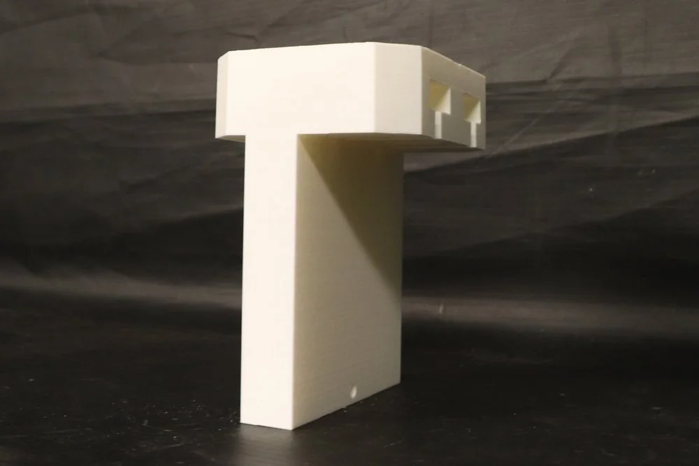
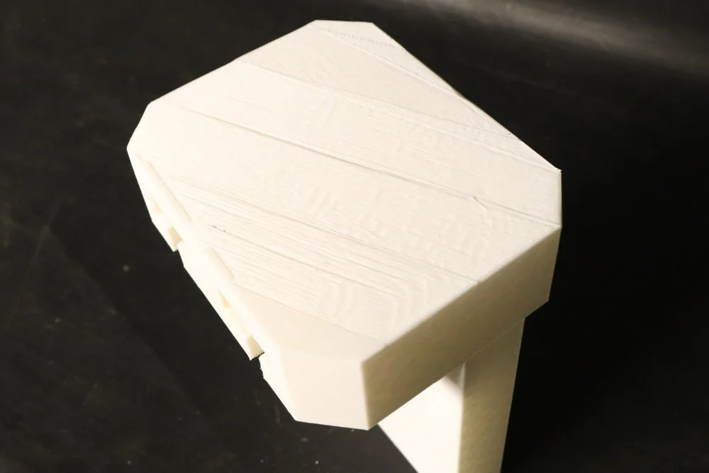
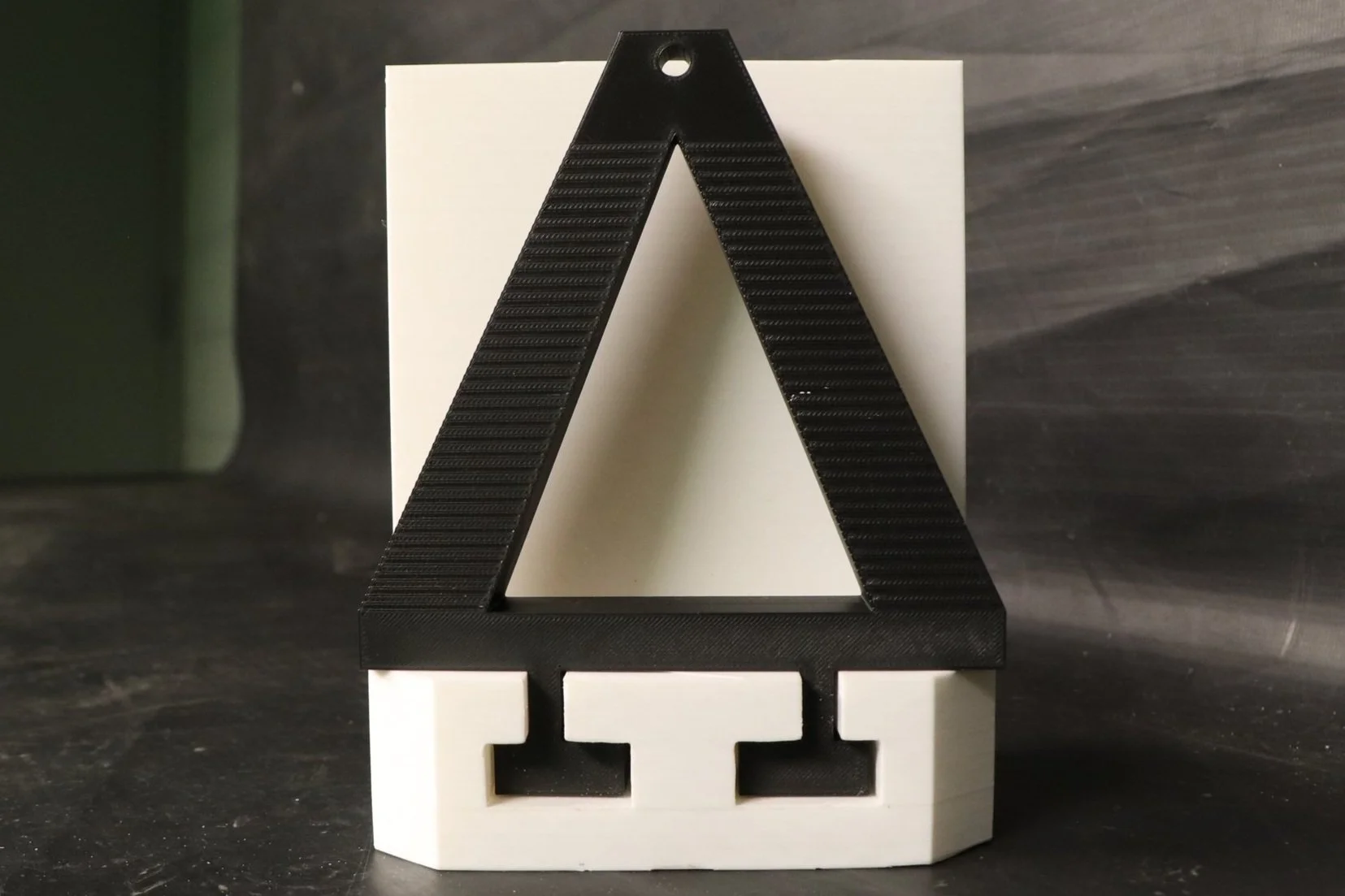
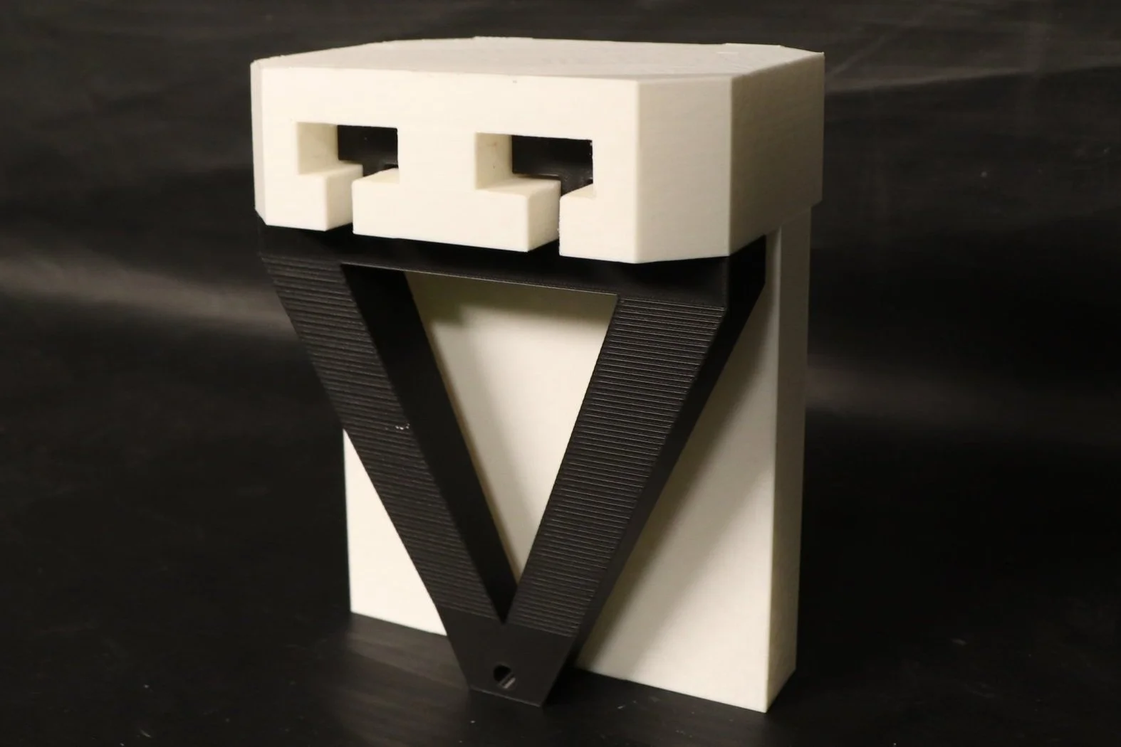
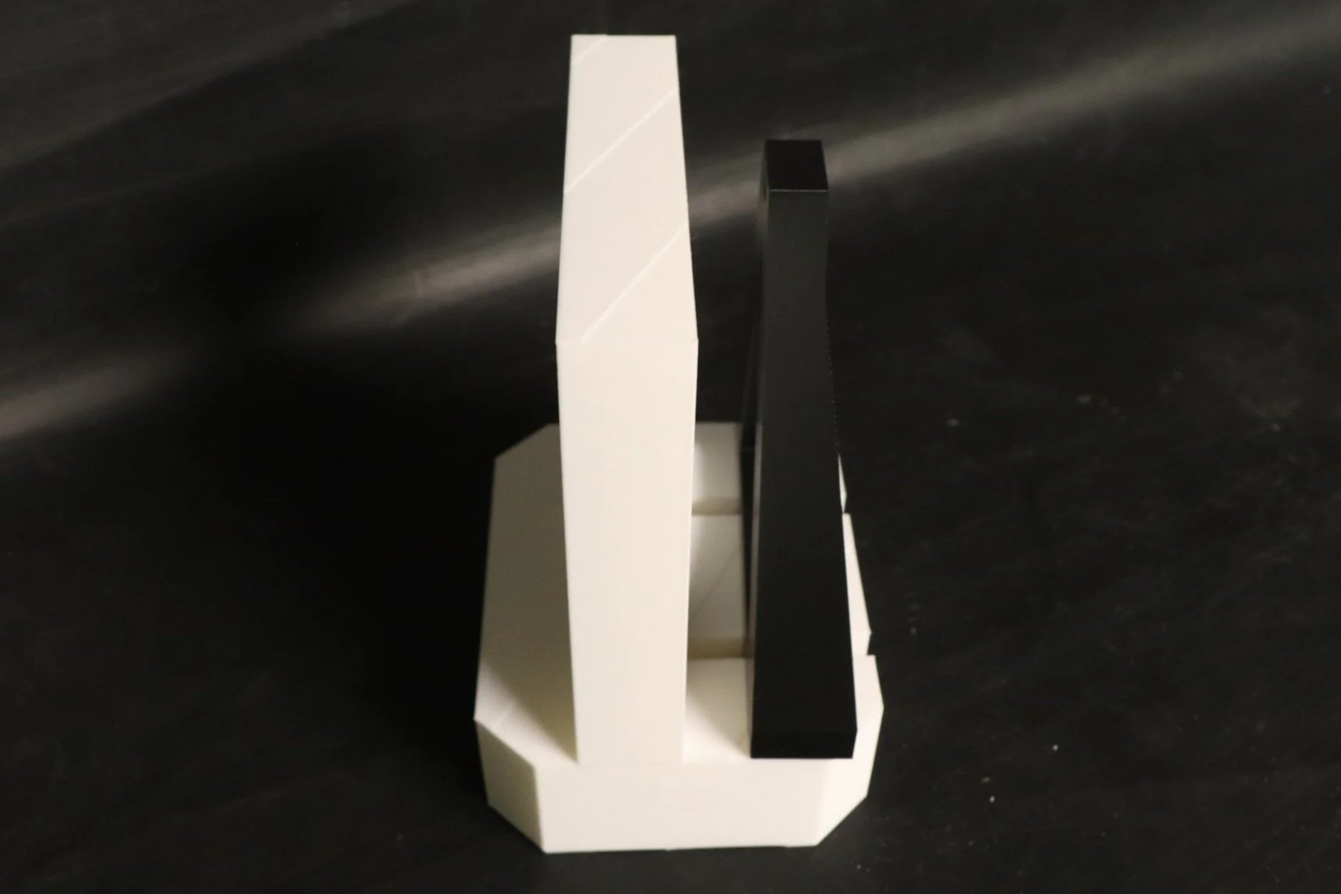
After moving into our dorms, I met Ariel, who lives down the hall from me. A problem we both quickly noticed, is that since we have our beds lofted, climbing up the wooden slats on the side of the bed is uncomfortable for the feet. We decided to create a step that would attach onto the bed slats, giving more stepping room for the feet, increasing comfort. After talking about how the step would operate logistically with concern to the hanging and locking mechanisms, I sketched out what I envisioned our discussion looking like. We chose to have two separate pieces that fit together with runners and would be locked together with a bolt going through the bottom of the two pieces. We each simultaneously modeled one of the two pieces in a CAD, frequently checking with each other about the design and comparing models. We chose to 3D-print this prototype because of the speed, precision, and strength of the 3D-printing would bring. These qualities were important for the step components to fit together perfectly and to allow for the prototype to be weight tested. After the first print, we realized the part that would slide into the other (yellow) was too large to fit. Despite sanding this down in an effort to make it fit, it wouldn’t work. I decided to redesign the sliding piece to be a new, lighter, and slightly smaller piece (black) that we remeasured to ensure it would fit into the actual step component (white). After this redesign, which took a more angular and industrial approach to match the step component, the two pieces fit together and the prototype was finally completed. We chose to have this angular design in the prototype to eliminate the possibility of structural flaws that could be possible with more fluid design.
08 - POSTER
2023
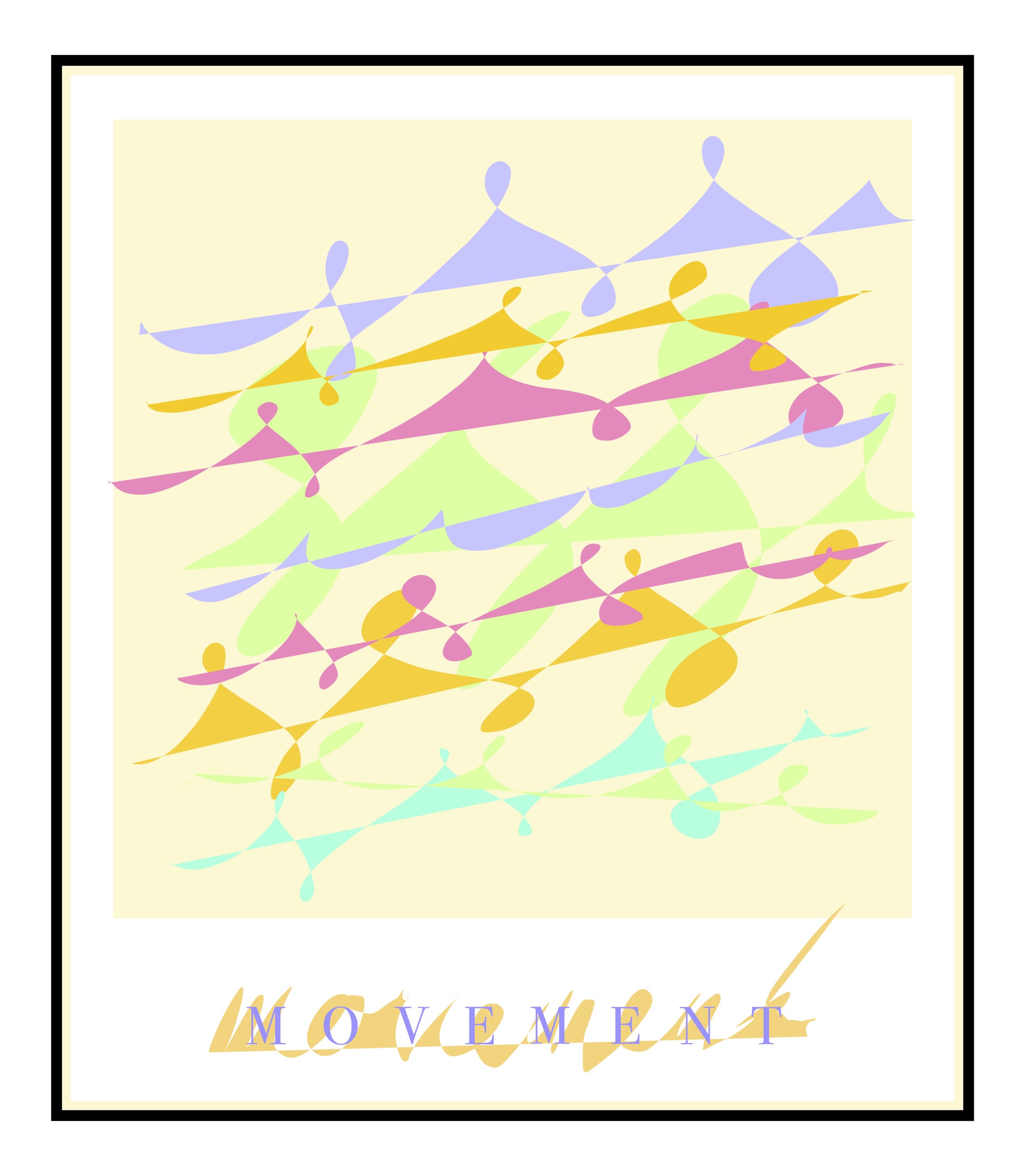
After attending the Frankenstein Ballet at Fletcher Opera Theater, I was inspired to create an art piece that captured the grace and elegance of the dancers. The beauty and intention held in every movement was truly mesmerizing to watch. I used light hues of colors to reflect the lightness in the dancer’s movement, and to depart from the theme of the ballet itself, focusing solely on the dancers. I used a pattern that was seamless, made from one "brushstroke”, in order carry the feeling of movement throughout the piece. I also used various sizes and angles of incline in the repeating the pattern to add interest and show the dancers moving in their own direction and capacity. Digital art is a fairly recent foray for me, but I feel that this piece demonstrates my understanding of digital drawing principles and my ability to adapt my art form to a variety of mediums.
09 - RICE BOWL
2023
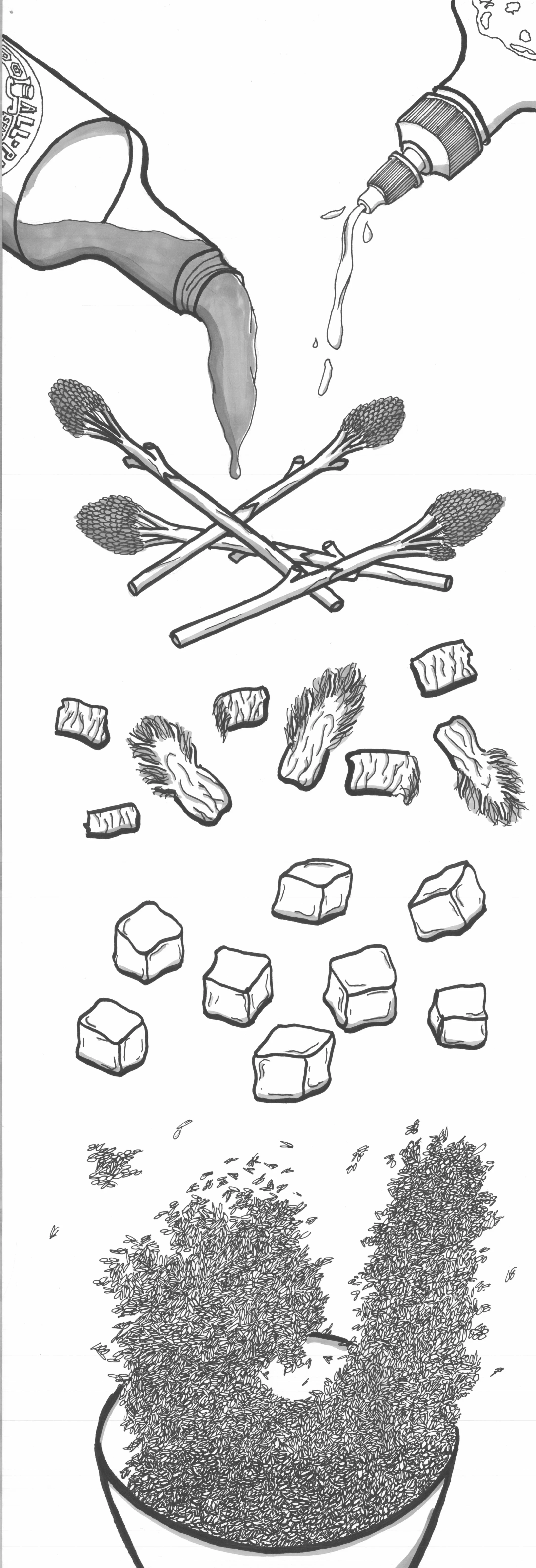
I was tasked with creating an exploded drawing of my favorite meal by my professor in order to gain an understanding of how the different parts of a whole come together. We worked with familiar forms so that we could connect this lesson with everyday objects. I learned more about how to draw objects in relationship to one another, especially with the use of gravity and light, through this project. I chose to draw a tofu, kimchi, and broccolini rice bowl with soy sauce and sriracha. After creating the drawing for the first time (left), our professor asked us to draw it again. This time we would take into consideration the critiques from ourselves, our classmates, and the professor. In my second drawing (right) I focused on carrying the detail throughout the piece, instead of it being concentrated almost entirely in the rice. I also gave the sauces at the top of the page more context so their substance would be clearer. Additionally, I sought to remove the blank space of the bowl that existed in the first drawing.
10 - TALLEY
2023
I was inspired to go urban sketching by some friends who took an urban sketching workshop and raved about it afterwards. One afternoon, I went and sat outside of Talley Student Union, sketching what I observed of the scenery (black ink). Although I am familiar with the area, I found new details that had never stuck out to me before. For instance, I payed more attention than I ever had to the amount and variety of detailing in the windows. I throughly enjoyed the sketching process, and ended with a simple pencil sketch that I went over in ink. The next day I uploaded my drawing to an iPad and digitally annotated my drawing with my imaginations for the future of Talley (red, yellow, green, purple, brown). I chose to add these digitally for the smooth and vibrant quality of digital lines. My imaginings include a train station connected to the Student Union, wind turbines in the background, added greenery, and additional seating, all things that I believe would enhance Talley for all who use it.

